The reverse side of a postcard, intended for addresses, postage, and often a short message, presents a unique design challenge. This area must accommodate required elements while also offering an opportunity for visual branding or thematic continuation from the front. A well-executed example might incorporate a subtle logo, a continuation of a color scheme, or even a miniature version of the front image.
Effective treatment of this space enhances the overall presentation and can leave a lasting impression on the recipient. Historically, this area has evolved alongside printing and postal regulations, reflecting changing communication styles and aesthetic trends. A thoughtful approach can transform a functional necessity into a valuable piece of the overall communication.
This article will explore key elements of creating visually appealing and functional address-side layouts, including best practices for typography, layout, and incorporating branding elements. Further sections will delve into specific design considerations for various postcard types, from promotional mailers to personal correspondence.
Tips for Effective Address-Side Layouts
Creating a visually appealing and functional reverse side is crucial for any postcard. These tips offer guidance on maximizing impact and ensuring deliverability.
Tip 1: Prioritize Clarity for Postal Workers. Legible addresses and correctly placed postage are paramount. Adequate spacing around these elements ensures efficient processing.
Tip 2: Maintain Visual Balance. Distribute elements evenly to avoid a cluttered or lopsided appearance. Consider the placement of the address block, postage, and any additional graphics or text.
Tip 3: Extend Front-Side Design Elements. Carry over colors, fonts, or graphic motifs from the front to create a cohesive visual identity. This strengthens brand recognition and creates a polished presentation.
Tip 4: Incorporate Branding Subtly. A small logo or tagline can reinforce branding without overwhelming the address area. Avoid large or distracting elements that might interfere with postal requirements.
Tip 5: Choose Appropriate Typography. Select fonts that are easy to read and complement the overall design. Maintain consistent font usage throughout the postcard.
Tip 6: Consider Pre-Printed Lines or Boxes. These can guide handwriting and ensure a neat, organized appearance, particularly beneficial for handwritten addresses.
Tip 7: Leave Space for a Short Message. Even a small designated area for a handwritten note adds a personal touch, particularly for announcements or invitations.
By following these guidelines, one can transform a purely functional area into a valuable design asset, enhancing communication and reinforcing brand identity.
This exploration of address-side design sets the stage for a deeper dive into specific postcard applications and advanced design techniques.
1. Address Legibility
Address legibility is paramount for successful postcard delivery and represents a critical component of effective back design. A clear, easily readable address ensures efficient processing by postal services, directly impacting the postcard’s ability to reach its intended recipient. Ignoring this fundamental aspect can render the entire communication effort futile, regardless of the front design’s quality or the message’s content.
- Font Selection
Choosing an appropriate font significantly impacts legibility. Simple, sans-serif fonts with clear letterforms, such as Helvetica or Arial, are generally preferred over ornate or script fonts. A font size of at least 10 points is recommended. Using excessively small or decorative fonts can hinder readability, leading to potential misrouting or delays.
- Ink Color and Contrast
Sufficient contrast between the ink color and the postcard background is essential. Dark ink on a light background offers optimal readability. Light ink on a light background or dark ink on a dark background can create significant challenges for optical character recognition and manual sorting. Real-world examples include black ink on a white or cream background or a dark blue ink on a light yellow background.
- Handwriting Clarity
If handwriting the address, legibility remains crucial. Printing clearly and consistently, using block letters, improves readability. Inconsistent slant, irregular letter sizes, and flourishes can hinder recognition. Pre-printed guidelines or boxes can aid in maintaining consistent letter height and spacing, promoting a neater, more legible address.
- Address Formatting and Placement
Correct address formatting and placement are equally important. Adhering to postal regulations and using the correct order for address components (name, street address, city, state, and zip code) ensures efficient processing. Placing the address within a designated area, clearly separated from other design elements, further enhances readability and avoids confusion. Examples include using a designated box or clearly defined area on the right-hand side of the postcard.
These facets of address legibility, when properly addressed, contribute significantly to successful postcard delivery and reflect a professional and thoughtful approach to design. A well-executed back design seamlessly integrates these elements, ensuring that the postcard’s message reaches its destination while reinforcing the overall aesthetic and communicative intent.
2. Postage Placement
Postage placement, while seemingly a minor detail, plays a crucial role in effective postcard back design. Correct placement ensures efficient processing by postal services and contributes to the overall professional appearance. Understanding the interplay between postage placement and other design elements is essential for creating a functional and aesthetically pleasing reverse side.
- Designated Area
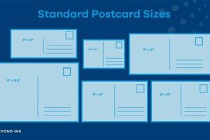
Most postcards feature a designated area for postage, typically located in the upper right corner. Adhering to this convention ensures automated processing and avoids potential delays. Deviating from this standard can confuse postal machinery and lead to manual processing or rejection. Examples include the pre-printed box or outlined area commonly found on commercially produced postcards.
- Clearance and Spacing
Adequate clearance around the postage area is crucial. Avoid placing design elements, text, or address components too close to the postage. Sufficient spacing prevents interference with automated scanning and cancellation. A clear margin of at least 1/4 inch is generally recommended. Observing this practice ensures efficient processing and a clean, uncluttered appearance.
- Postage Type Considerations
Different postage types, such as stamps, metered postage, or pre-printed indicia, may have specific placement requirements. Understanding these requirements is essential for compliance and efficient processing. For instance, stamps should be affixed firmly within the designated area without overlapping edges. Metered postage should be printed clearly and completely within the designated space. Consulting postal guidelines provides clarity on these specifications.
- Integration with Overall Design
While functionality remains paramount, postage placement can be integrated into the overall design aesthetic. The choice of stamps, for example, can complement the postcard’s theme or color scheme. Subtle design elements around the postage area, while respecting clearance requirements, can enhance visual appeal. This integration demonstrates attention to detail and elevates the postcard beyond a purely functional communication piece.
Careful consideration of postage placement, alongside other design elements, contributes significantly to a successful postcard. Proper placement not only ensures efficient delivery but also reflects a professional and thoughtful approach to design, enhancing the recipient’s overall impression.
3. Branding Integration
Branding integration within postcard back design extends brand identity beyond the primary visual message, reinforcing recognition and recall. Subtle yet strategic placement of brand elements on the reverse side transforms a functional area into a valuable touchpoint, contributing to a cohesive and professional communication piece.
- Logo Placement
Incorporating a small, unobtrusive logo within the address side reinforces brand presence without overwhelming other essential elements. Placement options include the upper left corner, below the return address, or subtly integrated within a pre-printed design element. A travel agency might include its logo discreetly near the return address, maintaining visual balance while reinforcing brand identity.
- Color Palette Consistency
Extending the front side’s color palette to the back creates visual continuity and reinforces brand aesthetics. Using brand colors for borders, pre-printed lines, or background elements subtly strengthens brand recognition. A cosmetics company might use its signature pastel shades for pre-printed address lines, creating a cohesive visual experience.
- Typography Continuity
Consistent typography between the front and back strengthens brand identity and contributes to a polished, professional appearance. Utilizing brand fonts for any text on the address side, such as taglines or website URLs, reinforces brand recognition. A design firm might use its signature font for its website address printed on the back, maintaining brand consistency.
- Tagline or Slogan Integration
Subtly incorporating a tagline or slogan on the address side reinforces key brand messaging. Placement options include below the address block or discreetly integrated within a decorative element. A fitness center could include its motivational tagline below the address, further promoting its brand ethos.
Strategic branding integration on the postcard’s reverse side maximizes impact and contributes to a cohesive brand experience. These subtle yet impactful elements elevate the postcard from a simple communication tool to a powerful brand reinforcement vehicle, enhancing overall effectiveness.
4. Message Space
Message space, a crucial element of postcard back design, directly impacts the sender’s ability to personalize communication. This designated area, often located on the left side or below the address block, allows for handwritten notes, brief messages, or specific instructions, enhancing the recipient’s experience. A postcard announcing a store opening might include a handwritten invitation to a launch event within the message space, adding a personal touch to a mass-produced communication.
Several factors influence message space utility. Size dictates message length and detail. Placement relative to other elements affects visual balance and readability. Clear delineation from the address block prevents confusion. A postcard promoting a travel destination might feature a larger message space to accommodate details about booking discounts, while a wedding invitation postcard might prioritize a smaller, more formal message area. Practical applications extend to appointment reminders, thank-you notes, or specific delivery instructions, highlighting the versatility of this design element.
Effective incorporation of message space elevates postcard communication beyond a purely visual medium. This seemingly minor detail allows for personalized interaction, strengthening the sender-recipient connection. Challenges include balancing space allocation with other design elements and maintaining visual clarity. Successfully addressing these challenges results in a more impactful and engaging communication piece.
5. Visual Balance
Visual balance in postcard back design refers to the harmonious arrangement of elements, creating a sense of equilibrium and visual appeal. A balanced design guides the recipient’s eye smoothly across the surface, ensuring all essential information is easily accessible and contributing to a professional and polished impression. Lack of balance can result in a cluttered or disjointed appearance, diminishing the postcard’s effectiveness.
- Weight Distribution
Elements possess visual weight based on size, color, and contrast. Balancing heavier elements, like the address block, with lighter elements, such as a logo or tagline, prevents one side from dominating. For example, placing the address block on the right and a small logo on the left achieves balance. Uneven weight distribution can make the postcard appear lopsided or unstable, hindering readability and aesthetic appeal.
- Whitespace Utilization
Whitespace, the empty space around elements, plays a crucial role in visual balance. Sufficient whitespace prevents a cluttered appearance and allows each element to stand out. For instance, ample margins and spacing around the address and postage area improve readability. Overcrowding elements diminishes whitespace, creating a visually chaotic and unprofessional design.
- Alignment and Grids
Utilizing alignment and grids creates structure and order. Aligning elements to a common axis, whether vertical or horizontal, creates a sense of unity and organization. Grid systems further enhance visual balance by providing a framework for element placement. A postcard with a clear grid structure for the address, postage, and logo appears organized and professional. Misaligned or randomly placed elements disrupt visual flow and create a disorganized impression.
- Contrast and Emphasis
Contrast, created through differences in size, color, or shape, can be strategically employed to create visual interest and guide the recipient’s eye. Careful use of contrast helps emphasize important elements, such as the address or a call to action. A brightly colored stamp against a neutral background draws attention to the postage area. Excessive or poorly implemented contrast can create visual clutter and distract from essential information.
Achieving visual balance on a postcard’s reverse side enhances readability, professionalism, and overall aesthetic appeal. A balanced design ensures that the postcard effectively communicates essential information while reinforcing the sender’s brand and message, making a lasting positive impression on the recipient.
Frequently Asked Questions
This section addresses common queries regarding effective postcard back design, offering practical insights and clarifying potential misconceptions.
Question 1: What is the optimal layout for postcard back design?
Optimal layout prioritizes functionality and visual appeal. Key elements include a clearly defined address block on the right, a designated postage area in the upper right corner, and sufficient space for a short message. Branding elements should be incorporated subtly without compromising essential information.
Question 2: How can one ensure address readability for postal services?
Legibility is paramount. Use a clear, sans-serif font in a minimum 10-point size. Ensure sufficient contrast between ink color and background. If handwriting, print legibly in block letters. Adhere to proper address formatting and placement guidelines.
Question 3: What are the standard dimensions for the address block?
While specific dimensions vary, a general guideline is approximately 3.5 inches wide by 2 inches high, positioned approximately 1 inch from the right edge and 1.5 inches from the top. This allows ample space for most addresses while maintaining visual balance.
Question 4: Can branding elements be incorporated on the back of a postcard?
Yes, branding elements such as logos, taglines, or website URLs can enhance the back design, provided they don’t interfere with essential information or postal regulations. Subtle and strategic placement reinforces brand identity without compromising functionality.
Question 5: Is it necessary to include a message space on the back?
While not strictly mandatory, incorporating a message area significantly enhances personalization, allowing for handwritten notes or specific instructions. This designated space contributes to a more engaging and impactful communication.
Question 6: How can one achieve visual balance in the back design?
Visual balance is achieved through careful element arrangement and whitespace utilization. Distribute elements evenly, avoiding overcrowding. Use alignment and grids for structure. Contrast can be employed strategically to highlight key information, enhancing overall aesthetic appeal.
Understanding these common concerns helps ensure effective postcard back design, maximizing both functionality and visual impact. Addressing these aspects comprehensively contributes to successful communication and reinforces professional presentation.
The subsequent sections will provide in-depth examples and case studies showcasing best practices in postcard back design across various applications.
Postcard Back Design
Effective postcard back design is more than a mere formality; it is a crucial component of successful communication. This exploration has highlighted the essential elements contributing to a functional and aesthetically pleasing reverse side, including address legibility, postage placement, branding integration, message space, and visual balance. Each aspect plays a vital role in ensuring deliverability, reinforcing brand identity, and enhancing recipient engagement. Careful consideration of these elements transforms a utilitarian space into a valuable communication asset.
Postcard back design, often overlooked, presents a significant opportunity to elevate communication impact. By understanding and implementing the principles outlined herein, one can maximize the potential of this often-underutilized space. The effectiveness of any postcard campaign hinges on the thoughtful execution of both front and back design, creating a cohesive and impactful message that resonates with the recipient.


