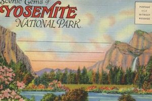
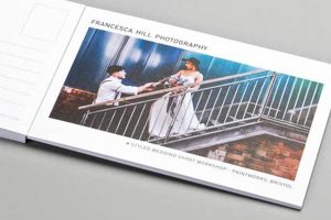
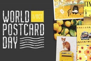
The aesthetic characterized by vintage or antique postcard imagery evokes a sense of nostalgia and historical charm. Think of faded colors, stylized typography, and scenes depicting travel destinations or everyday life from a bygone era. A common example includes images of iconic landmarks, seaside resorts, or idyllic countryside landscapes, often bordered by a white frame and bearing faux postage marks or handwritten messages.
This style offers a powerful connection to the past, capable of transporting viewers to another time and place. Its popularity stems from the evocative nature of old postcards, which serve as tangible snapshots of history and culture. This visual language can lend a unique and appealing quality to various design applications, from graphic design and branding to interior decor and fashion. The style’s nostalgic appeal contributes to its enduring presence in contemporary creative endeavors.
This exploration of vintage postcard imagery provides a foundation for understanding its influence on contemporary design trends and its potential applications across various creative fields. Further examination will delve into specific case studies and analyze the evolution of this aesthetic over time.
Tips for Utilizing Vintage Postcard Aesthetics
Successfully incorporating elements reminiscent of antique postcards requires careful consideration of several key aspects. The following tips offer guidance on effectively leveraging this nostalgic style.
Tip 1: Color Palette: Employ a muted color palette with faded tones, such as sepia, cream, pale blues, and greens, to authentically capture the aged look of vintage postcards. Consider adding subtle color washes or textures for enhanced realism.
Tip 2: Typography: Opt for classic serif or script typefaces that evoke the era of traditional postcards. Experiment with distressed effects or slightly uneven baselines to create a sense of age and authenticity.
Tip 3: Imagery: Select images that depict scenes typical of vintage postcards, such as landscapes, cityscapes, travel destinations, or everyday life from the past. Consider incorporating iconic landmarks or historical figures.
Tip 4: Borders and Frames: Utilize decorative borders and frames, often white or cream-colored, to mimic the classic postcard format. Experiment with subtle embellishments or faux postage marks.
Tip 5: Textures: Incorporate subtle textures like paper grain or linen to create a tactile and aged appearance, further enhancing the vintage feel.
Tip 6: Composition: Consider the layout and composition of traditional postcards. Often, a central image is framed by text or decorative elements. Simplicity and balance are key.
Tip 7: Modern Applications: Explore integrating vintage postcard aesthetics into contemporary designs, such as website banners, social media graphics, packaging, or interior decor.
By understanding these core elements, one can effectively utilize the vintage postcard aesthetic to evoke a sense of nostalgia and historical charm in various design applications.
These practical tips facilitate the successful incorporation of the vintage postcard aesthetic, offering a pathway to creating visually appealing and evocative designs. This foundation allows for a deeper exploration of specific applications and further analysis of this style’s enduring influence.
1. Nostalgia
Nostalgia plays a crucial role in the appeal of the vintage postcard aesthetic. The faded colors, aged textures, and often-depicted historical scenes evoke a sense of longing for the past, even for times one hasn’t personally experienced. This connection to history contributes significantly to the charm and enduring popularity of the style. The power of nostalgia lies in its ability to transport individuals to another era, fostering a sense of connection and comfort. Consider the imagery of a grand hotel from the early 20th century, printed on a postcard with slightly yellowed edges. The image itself may depict a scene the viewer has never witnessed, yet the stylistic elements evoke a sentimental longing for a simpler time.
This emotional connection strengthens the impact of “postcard retro” designs. By tapping into nostalgic sentiments, designs can resonate more deeply with audiences. Marketing campaigns, for example, can leverage this by incorporating vintage postcard elements to create a sense of familiarity and trust. Similarly, interior design can utilize this aesthetic to create spaces that feel both comforting and stylish. A cafe, for instance, might use vintage postcard-inspired artwork to foster a welcoming and nostalgic atmosphere. The specific nostalgic associations will vary depending on the individual and their cultural background, but the underlying principle of connecting to the past remains constant.
Understanding the interplay between nostalgia and the “postcard retro” aesthetic is crucial for effectively utilizing this style. While the specific imagery and design elements contribute to the overall effect, it’s the underlying emotional resonance of nostalgia that truly elevates the aesthetic. Recognizing this connection enables designers and marketers to create more impactful and engaging work that resonates with audiences on a deeper level. Future explorations of this style should consider the cultural and historical contexts that further shape nostalgic interpretations.
2. Vintage Typography
Vintage typography plays a significant role in establishing the “postcard retro” aesthetic. Specific typefaces and typographic treatments contribute to the overall sense of nostalgia and historical authenticity. Analyzing the characteristics of vintage typography provides a deeper understanding of its impact within this design style.
- Serif and Script Typefaces
Serif and script typefaces are commonly associated with vintage design. These typefaces, popular in the early to mid-20th century, often feature ornate details and elegant curves, reminiscent of traditional printing methods. Examples include typefaces like Bodoni, Didot, and various script fonts. Their presence in “postcard retro” designs reinforces the connection to the past, evoking a sense of classic elegance and timeless appeal. These typefaces are frequently used for titles, headers, and other prominent textual elements on postcards, contributing significantly to the overall vintage aesthetic.
- Decorative Elements and Ornaments
Vintage typography frequently incorporates decorative elements and ornaments, such as flourishes, swirls, and borders. These embellishments further enhance the nostalgic appeal, adding intricate detail and visual interest. Common examples include corner ornaments, dividers, and decorative frames surrounding text. These elements contribute to the overall visual richness of “postcard retro” designs, echoing the craftsmanship and attention to detail characteristic of historical printing practices.
- Distressed Effects and Textures
Distressed effects, such as rough edges, ink bleeds, and textured overlays, contribute to the aged appearance of vintage typography. These imperfections enhance the sense of authenticity and historical context, suggesting the passage of time. Examples include subtly textured backgrounds resembling aged paper or the appearance of slightly faded ink. These effects deepen the nostalgic impact of “postcard retro” designs, reinforcing the connection to the past.
- Typographic Layout and Hierarchy
The layout and hierarchy of text in vintage typography also contribute to the overall aesthetic. Traditional postcard designs often feature a clear hierarchy, with prominent titles and smaller supporting text. The arrangement of text elements contributes to visual balance and clarity. Examples include centered titles with decorative borders or text arranged in a classic postcard format. This structured approach contributes to the organized and often symmetrical feel of “postcard retro” designs.
These facets of vintage typography combine to create a powerful visual language that significantly contributes to the “postcard retro” aesthetic. Understanding the historical context and stylistic characteristics of these typographic elements provides valuable insights into their continued relevance and enduring appeal in contemporary design. By carefully selecting and implementing these elements, designers can effectively evoke the charm and nostalgia associated with vintage postcards.
3. Faded Colors
Faded colors constitute a defining characteristic of the “postcard retro” aesthetic. The muted tones evoke a sense of age and nostalgia, contributing significantly to the overall vintage charm. Examining the specific roles and implications of faded colors provides a deeper understanding of their contribution to this style.
- Color Palettes
Typical “postcard retro” color palettes utilize muted tones of blues, greens, yellows, and reds. These colors, often desaturated and softened, mimic the appearance of aged pigments and dyes. Examples include faded teal, pale rose, dusty yellow, and muted seafoam green. These palettes contribute to the overall sense of nostalgia and historical authenticity.
- Printing Processes
The faded appearance of vintage postcards often stems from the limitations of historical printing processes. Early printing methods often resulted in color variations and fading over time. This inherent imperfection contributes to the unique charm of the “postcard retro” style. The subtle variations in color density and saturation create a textured and visually appealing effect, reminiscent of antique printing techniques.
- Emotional Impact
Faded colors evoke a sense of nostalgia and romanticism. The softened hues contribute to the overall vintage charm, suggesting the passage of time and the beauty of imperfection. This emotional resonance contributes significantly to the appeal of “postcard retro” designs. The muted tones can evoke feelings of warmth, comfort, and longing for the past.
- Contemporary Applications
Contemporary designs can leverage faded colors to achieve a “postcard retro” aesthetic. By incorporating desaturated hues and subtle color variations, designers can evoke a sense of nostalgia and vintage charm. This technique is frequently employed in branding, graphic design, and interior decor to create a specific mood and aesthetic. Examples include using faded colors in website backgrounds, product packaging, and textile designs.
The use of faded colors is integral to the “postcard retro” aesthetic. These colors contribute not only to the visual appeal but also to the emotional impact of the style. By understanding the specific roles and implications of faded colors, designers can effectively leverage this element to create evocative and engaging designs that resonate with audiences. Further exploration could analyze the specific color combinations and their cultural significance within different historical periods, providing a deeper understanding of the nuanced relationship between color and nostalgia in “postcard retro” design.
4. Travel Imagery
Travel imagery forms a cornerstone of the “postcard retro” aesthetic, inextricably linked to the historical function of postcards as souvenirs and communication tools from journeys abroad. Analyzing the specific types of travel imagery commonly employed within this style reveals deeper insights into its evocative power and enduring appeal.
- Landmarks and Monuments
Depictions of famous landmarks and monuments, such as the Eiffel Tower, the Statue of Liberty, or the Great Pyramids, frequently appear in “postcard retro” imagery. These iconic structures symbolize specific destinations and evoke a sense of wanderlust and historical significance. Their presence reinforces the connection between postcards and travel, serving as visual reminders of memorable experiences or aspirational destinations.
- Scenic Landscapes
Picturesque landscapes, including mountains, coastlines, and rural scenes, represent another prevalent category of travel imagery within this aesthetic. These idyllic depictions often romanticize travel, emphasizing the beauty and escapism associated with exploring new environments. Images of rolling hills, tranquil lakes, or dramatic sunsets contribute to the nostalgic and idealized portrayal of travel destinations.
- Modes of Transportation
Vintage modes of transportation, such as steam trains, ocean liners, and classic automobiles, frequently feature in “postcard retro” designs. These vehicles symbolize the journey itself, evoking a sense of adventure and the romance of travel in a bygone era. Their inclusion adds a layer of historical context and reinforces the connection to the past.
- Local Culture and Activities
Depictions of local culture and activities, such as traditional costumes, markets, or festivals, offer glimpses into the unique character of different destinations. These images contribute to the ethnographic aspect of “postcard retro,” providing visual narratives of cultural experiences and encounters. They further enhance the sense of exploration and discovery associated with travel.
These distinct categories of travel imagery contribute significantly to the evocative power of the “postcard retro” aesthetic. By combining recognizable landmarks with romanticized landscapes and cultural depictions, this style creates a powerful sense of nostalgia and wanderlust. Understanding the specific types of imagery employed and their historical context provides valuable insights into the enduring appeal of this aesthetic in contemporary design. Further exploration might consider the evolving representation of travel destinations over time and the influence of changing cultural perspectives on “postcard retro” imagery.
5. Historical Context
Understanding the historical context of postcards is crucial for a comprehensive appreciation of the “postcard retro” aesthetic. Postcards emerged in the late 19th century, evolving from simple postal cards to illustrated souvenirs and communication tools. This evolution significantly shaped the visual language associated with “postcard retro,” influencing the imagery, typography, and overall aesthetic. Examining specific historical facets provides a deeper understanding of this connection.
- The Golden Age of Postcards (1890s-1910s)
The “Golden Age of Postcards” witnessed a surge in postcard production and popularity. Advances in printing technology enabled mass production and wider distribution. This era established many of the visual conventions associated with “postcard retro,” including lithographic printing, ornate typography, and idyllic depictions of travel destinations. The postcards from this period often showcase a romanticized view of the world, reflecting the optimistic spirit of the time.
- World War I and Propaganda
During World War I, postcards became a medium for propaganda and patriotic messaging. Images of soldiers, flags, and national symbols proliferated, reflecting the wartime context. This period demonstrates how historical events can influence the imagery and themes depicted on postcards, shaping the visual language associated with “postcard retro.” The use of bold colors and strong graphic elements in wartime postcards further influenced the aesthetic.
- Mid-20th Century Travel and Tourism
The mid-20th century witnessed the rise of mass tourism, and postcards became ubiquitous souvenirs. Images of popular travel destinations, roadside attractions, and vacation activities proliferated, reflecting the changing landscape of leisure and travel. This period contributed to the vast archive of vintage postcard imagery that continues to inspire “postcard retro” designs today. The development of color photography during this time also significantly impacted the aesthetic.
- Decline and Revival
With the rise of other communication technologies, the popularity of postcards declined in the latter half of the 20th century. However, recent years have seen a resurgence of interest in vintage postcards and the “postcard retro” aesthetic. This renewed interest reflects a broader trend of nostalgia and a fascination with historical design. Contemporary designers often draw inspiration from vintage postcards, incorporating elements of the aesthetic into various creative fields.
These historical facets demonstrate the close relationship between the evolution of postcards and the development of the “postcard retro” aesthetic. By understanding the historical context of postcard production, distribution, and usage, one gains a deeper appreciation for the stylistic elements and cultural significance of this enduring design trend. This historical perspective provides a foundation for analyzing the continued influence of “postcard retro” in contemporary design and its ability to evoke nostalgia and a connection to the past.
Frequently Asked Questions about the “Postcard Retro” Aesthetic
This section addresses common inquiries regarding the “postcard retro” aesthetic, providing clarity and further insights into its characteristics and applications.
Question 1: How does one differentiate “postcard retro” from other vintage styles?
While “postcard retro” shares elements with other vintage styles, its distinct connection to travel imagery, postcard-specific typography (often including decorative borders and faux postage marks), and the use of faded colors set it apart. Other vintage styles might focus on different eras or themes without the specific postcard-related elements.
Question 2: What are the key elements to consider when incorporating this aesthetic into a design project?
Key elements include muted color palettes, vintage typography (serif and script fonts), travel-related imagery (landmarks, landscapes, modes of transport), decorative borders, and a slightly distressed or aged effect. Balance and simplicity in composition are also crucial.
Question 3: Is “postcard retro” suitable for all types of design projects?
While the versatility of “postcard retro” allows for diverse applications, its suitability depends on the specific project goals and target audience. Projects aiming to evoke nostalgia, travel, or a vintage aesthetic benefit most. It might be less suitable for projects requiring a modern or minimalist approach.
Question 4: Are there common misconceptions about this aesthetic?
A common misconception is that “postcard retro” is simply using any vintage image. The specific combination of elements related to historical postcards is crucial. Another misconception is that it’s inherently kitsch; skillful execution can create sophisticated and elegant designs.
Question 5: How can one avoid clichs when using “postcard retro”?
Avoid overused imagery and typography. Experiment with unique color combinations and explore lesser-known historical references. Focus on conveying a genuine sense of nostalgia rather than simply mimicking superficial elements.
Question 6: What is the future of the “postcard retro” aesthetic?
While trends evolve, the underlying appeal of nostalgia and historical connection suggests the “postcard retro” aesthetic will likely endure. Its future may involve reinterpretations and adaptations, blending vintage elements with contemporary design approaches.
Understanding the nuances of “postcard retro” enables effective implementation, avoiding common pitfalls and maximizing its evocative potential. This understanding allows for a deeper appreciation of its unique charm and enduring appeal.
This FAQ section provides a solid foundation for further exploration of “postcard retro” in specific design contexts. The next section will delve into practical applications and case studies.
Conclusion
This exploration has delved into the multifaceted nature of the “postcard retro” aesthetic, examining its key components: nostalgia, vintage typography, faded colors, travel imagery, and historical context. Each element contributes to the distinctive charm and evocative power of this style. From the golden age of postcards to their contemporary resurgence, the enduring appeal of “postcard retro” lies in its ability to connect audiences with a romanticized past and the allure of travel and discovery. The interplay of these elements creates a powerful visual language capable of resonating deeply with viewers.
The “postcard retro” aesthetic offers a rich source of inspiration for contemporary design. Understanding its historical context and stylistic nuances allows for more effective and meaningful implementation across diverse creative fields. As visual culture continues to evolve, “postcard retro” stands as a testament to the enduring power of nostalgia and the timeless appeal of vintage aesthetics. Its continued presence in design suggests a lasting appreciation for the tangible connection to the past and the enduring romance of travel. Further exploration of specific applications and adaptations will undoubtedly reveal new dimensions of this evocative style.


