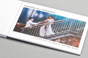
The arrangement of elements on a postcard, including address placement, postage area, message space, and imagery, is crucial for successful delivery and reader engagement. A common layout involves dividing the card into two sections: one for the recipient’s address and postage, and the other for a personal message and often a visually appealing photograph or illustration.
A well-structured layout ensures efficient processing by postal services and enhances the recipient’s experience. Historically, standardized arrangements evolved alongside postal regulations and printing technologies. This structured approach allows for clear communication and a visually pleasing presentation, making the correspondence more impactful and memorable. Proper placement of elements prevents automated sorting machines from misreading addresses, thus reducing delivery delays.
Understanding these organizational principles is essential for effective communication through this traditional medium. The following sections will delve deeper into specific aspects, such as design principles, image selection, and writing effective messages, to further maximize the impact of this popular form of correspondence.
Tips for Effective Postcard Layout
Optimizing the arrangement of elements on a postcard significantly enhances its impact and ensures successful delivery. The following tips offer guidance on effective structuring.
Tip 1: Address Placement: Clearly position the recipient’s address on the right-hand side of the card within the designated area. Legible handwriting or printed labels are essential for accurate delivery.
Tip 2: Postage Area: Affix appropriate postage in the upper right-hand corner. Ensure the stamp or franking mark does not obstruct the address.
Tip 3: Message Space: Utilize the left-hand side for a concise and engaging message. Consider the available space when writing, and avoid overcrowding.
Tip 4: Image Selection: Choose high-quality images that complement the message and enhance visual appeal. Ensure images are appropriately sized and positioned to avoid obscuring other elements.
Tip 5: Balance and White Space: Maintain a balanced layout by distributing elements evenly. Adequate white space prevents a cluttered appearance and improves readability.
Tip 6: Card Stock: Select a sturdy card stock appropriate for mailing. Thicker stock provides durability and a more professional feel.
Tip 7: Font Selection: If printing the message, choose a legible font that complements the overall design. Avoid overly decorative or small fonts that may be difficult to read.
Careful attention to these organizational aspects ensures clear communication, efficient delivery, and a positive recipient experience.
By following these recommendations, one can create visually appealing and effective postcards that leave a lasting impression.
1. Layout
Layout is a fundamental aspect of postcard formatting. It dictates the arrangement of crucial elements, directly influencing both the postcard’s deliverability and its impact on the recipient. A well-considered layout ensures efficient processing by postal systems and enhances readability. For instance, placing the address in the designated area on the right-hand side ensures automated sorting machines can process the card correctly. Similarly, positioning the postage stamp in the upper right corner prevents interference with automated postmarking processes. A poorly planned layout can lead to misdirected mail or even rejection by postal services.
Furthermore, layout significantly impacts the recipient’s experience. A balanced and visually appealing arrangement enhances the message’s effectiveness. Consider a postcard featuring a scenic photograph. Positioning the image prominently on one side, while keeping the message concise and neatly arranged on the other, creates a positive visual impact and facilitates easy reading. Conversely, a cluttered or unbalanced layout can detract from the message and diminish the overall aesthetic appeal. Strategic use of white space can significantly enhance readability and visual appeal. This applies equally to handwritten and printed postcards.
In conclusion, layout serves as the backbone of effective postcard formatting. It directly influences successful delivery and shapes the recipient’s perception. A well-structured layout contributes not only to efficient postal processing but also to a more engaging and positive communication experience. Understanding the principles of effective layout is essential for creating impactful and memorable postcards. From ensuring accurate delivery to maximizing visual appeal, a thoughtfully designed layout elevates this simple form of correspondence.
2. Dimensions
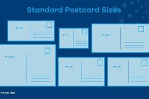
Dimensional standards play a crucial role in postcard formatting, impacting both mail processing and recipient perception. Adhering to established size guidelines ensures compatibility with automated postal systems and influences the available space for design elements. Understanding these parameters is essential for creating effective and deliverable postcards.
- Standard Sizing:
Common postcard sizes, such as the maximum size of 4-1/4″ x 6″ for USPS and slightly varying international standards, ensure efficient processing by postal machinery. Non-standard sizes can lead to surcharges or rejection. Selecting appropriate dimensions from the outset streamlines the design process and avoids potential mailing complications. This allows for optimal placement of key elements like the address, postage, and message.
- Impact on Design:
The chosen dimensions directly influence design choices. Smaller postcards necessitate concise messaging and careful image selection, while larger formats offer more flexibility but may increase printing costs. Understanding the interplay between size and design elements is critical for achieving a balanced and visually appealing final product. Designers must consider the available area when incorporating text, graphics, and white space.
- International Considerations:
Variations in international postal regulations regarding acceptable postcard dimensions necessitate careful consideration when sending mail abroad. Researching destination-specific requirements avoids potential delivery issues. Slight differences in size allowances can necessitate adjustments to the design or selection of alternative postcard formats.
- Relationship with Weight:
While not a direct dimensional factor, the weight of the postcard is closely related and impacts postage costs. Thicker card stock, while offering a more premium feel, can increase weight and potentially incur additional postage fees. Balancing material choices with weight considerations contributes to cost-effective mailing. This necessitates careful selection of paper stock and printing methods.
In summary, adhering to appropriate dimensional standards ensures efficient processing, facilitates effective design choices, and avoids potential mailing complications. Careful consideration of size, weight, and international variations contributes significantly to a successful postcard campaign, whether for personal or commercial purposes. By acknowledging these parameters, creators can maximize the impact and deliverability of their postcards.
3. Address Placement
Address placement constitutes a critical element of postcard formatting, directly impacting deliverability. Accurate and clearly visible placement ensures efficient processing by postal services. Incorrect placement can lead to delays, misdirection, or even return-to-sender scenarios. The designated area for the address, typically the right-hand side of the postcard, allows automated sorting machines to read and process mail effectively. Obstructions within this area, such as images or overlapping text, can hinder automated sorting, potentially leading to manual processing and subsequent delays. Consider a postcard intended for an international destination; incorrect address formatting, including country-specific conventions, could result in the postcard being undeliverable.
Furthermore, legibility plays a vital role in successful address placement. Handwritten addresses should be clear and concise, avoiding stylistic flourishes that might hinder readability by optical character recognition (OCR) technology. Printed labels offer a standardized and often more reliable alternative, minimizing the risk of misinterpretation. The use of appropriate ink color, contrasting with the postcard’s background, further enhances readability. For instance, a light-colored address on a light background can be difficult for both human postal workers and automated systems to decipher, increasing the risk of delivery errors. Practical implications extend beyond individual mail pieces; businesses utilizing postcards for marketing campaigns must ensure accurate address placement on large quantities of mail to maximize campaign effectiveness and minimize wasted resources due to undeliverable items.
In summary, proper address placement is integral to successful postcard formatting. Accuracy, clarity, and adherence to designated areas ensure efficient processing by postal systems, minimizing delays and maximizing deliverability. Attention to legibility, whether handwritten or printed, further contributes to successful delivery. Understanding these factors enables effective communication through this established medium, from personal correspondence to large-scale marketing initiatives. Ignoring these seemingly minor details can have significant repercussions, highlighting the crucial role of address placement within the broader context of postcard formatting.
4. Image Selection
Image selection constitutes a crucial aspect of postcard formatting, significantly impacting a postcard’s overall effectiveness and communicative power. Appropriate imagery enhances the message, evokes emotions, and captures attention, while poorly chosen visuals can detract from the intended purpose. Understanding the interplay between image selection and postcard structure is essential for creating impactful and memorable pieces.
- Relevance to Message:
Image relevance directly influences message comprehension and recipient engagement. A postcard promoting a travel destination, for instance, benefits from an image showcasing a scenic vista or local landmark. Conversely, an irrelevant or generic image diminishes the message’s impact and can confuse the recipient. Choosing an image directly related to the postcard’s theme reinforces the message and strengthens its visual appeal. A birthday postcard, for example, would typically feature celebratory imagery rather than a landscape or product advertisement. This connection between visual and textual content strengthens the overall message and enhances its memorability.
- Image Quality and Resolution:
High-resolution images are crucial for maintaining visual clarity and professionalism. Pixelated or blurry images detract from the postcard’s overall quality and convey a lack of attention to detail. Printing processes can exacerbate image imperfections; therefore, selecting high-quality source material is paramount. The chosen resolution should align with the postcard’s dimensions to avoid distortion or loss of detail during printing. This ensures a crisp and visually appealing final product, reflecting positively on the sender, whether an individual or an organization.
- Composition and Visual Appeal:
Visually appealing imagery captures attention and enhances engagement. Consideration of compositional elements, such as rule of thirds, leading lines, and color balance, contributes to an aesthetically pleasing and impactful design. Images with strong visual appeal draw the recipient’s eye and create a more memorable experience. A well-composed image can convey a sense of place, evoke specific emotions, and enhance the overall message of the postcard. For example, an image with a clear focal point and balanced composition is more likely to capture attention than a cluttered or poorly arranged image.
- Placement and Integration with Text:
Image placement influences readability and overall design balance. Carefully positioning the image in relation to the text ensures neither element overshadows the other. Sufficient white space surrounding both image and text enhances readability and prevents a cluttered appearance. Successful integration enhances both the visual appeal and the clarity of the message. An image placed strategically to complement the text creates a harmonious and visually engaging layout. For example, positioning an image on one side of the postcard and the text on the other maintains a clear visual hierarchy and avoids competition for attention.
In conclusion, thoughtful image selection, considering relevance, quality, composition, and placement, significantly enhances postcard formatting. Strategic image choices elevate this communication medium, transforming a simple card into a visually compelling and memorable piece. By understanding the interplay between imagery and layout, one can maximize the impact and effectiveness of postcard communication, whether for personal or professional purposes. Careful consideration of these elements strengthens the overall message, capturing attention and leaving a lasting impression on the recipient.
5. Message Clarity
Message clarity represents a critical component of effective postcard formatting, directly influencing communicative success. A clear and concise message ensures the recipient readily understands the intended communication. Formatting choices, such as font selection, text size, and layout, directly impact message clarity. A postcard employing an excessively ornate or small font, for instance, can hinder readability, diminishing message comprehension. Similarly, a cluttered layout, with text overlapping images or other design elements, obscures the message and frustrates the recipient. Consider a marketing postcard promoting a special offer; if the terms of the offer are unclear due to poor formatting choices, potential customers are less likely to respond, impacting campaign effectiveness. Conversely, a well-formatted postcard with a clear and concise message enhances comprehension and encourages engagement.
The relationship between message clarity and postcard formatting extends beyond mere readability. Strategic formatting choices can emphasize key information and guide the recipient’s eye through the message. Employing bullet points, bold text, or contrasting colors directs attention to essential details, enhancing message retention. For example, a postcard announcing an event could utilize bold text to highlight the date, time, and location, ensuring these crucial details stand out. Moreover, aligning formatting choices with the overall tone and purpose of the postcard reinforces message clarity. A formal announcement, for instance, would typically employ a more traditional font and layout than a lighthearted invitation. This consistency between form and content strengthens message delivery and enhances comprehension. Practical applications extend to various contexts, from personal correspondence to business communications, underscoring the significance of message clarity within postcard formatting.
In summary, message clarity serves as a cornerstone of effective postcard communication. Formatting choices, including font selection, layout, and visual hierarchy, directly influence message comprehension and recipient engagement. Strategic formatting decisions enhance readability, emphasize key information, and reinforce the overall message. Understanding the interplay between message clarity and postcard formatting is essential for creating impactful and successful postcards, regardless of the specific communication objective. Failure to prioritize message clarity can undermine the effectiveness of the communication, highlighting the crucial role of clear and concise messaging within the broader context of postcard design.
Frequently Asked Questions about Postcard Formatting
This section addresses common inquiries regarding proper postcard structure and design, offering practical guidance for effective communication through this traditional medium.
Question 1: What are the standard postcard dimensions?
Standard postcard sizes vary by postal service. The United States Postal Service (USPS) accepts postcards up to 4-1/4″ x 6″. International standards may differ slightly, requiring research based on the destination country.
Question 2: How does address placement impact deliverability?
Accurate address placement within the designated area, typically the right-hand side of the postcard, is crucial for automated sorting. Incorrect or obscured addresses can lead to delays, misdirection, or return-to-sender situations.
Question 3: What image resolution is recommended for postcards?
High-resolution images, at least 300 dpi (dots per inch), are recommended to ensure print quality and avoid pixelation. Lower resolutions can result in blurry or distorted images, detracting from the postcard’s overall appearance.
Question 4: What font sizes are most legible on postcards?
Font sizes between 10 and 12 points generally offer optimal readability. Smaller fonts can strain the reader’s eyes, while excessively large fonts can appear unprofessional and consume valuable space.
Question 5: How does white space impact postcard design?
Adequate white space around text and images enhances readability and prevents a cluttered appearance. Strategic use of white space contributes to a more balanced and visually appealing design, improving overall impact.
Question 6: What considerations are important for international postcard mailings?
International mailings require adherence to destination-specific formatting guidelines, including address conventions and size restrictions. Consulting the postal regulations of the recipient’s country ensures successful delivery.
Understanding these fundamental aspects of postcard formatting contributes significantly to effective communication and successful delivery. Addressing these common concerns ensures that the intended message reaches its recipient in a clear and impactful manner.
The following section delves further into specific formatting examples and case studies, providing practical demonstrations of effective postcard design.
Postcard Formatting
Effective communication through the seemingly simple medium of a postcard relies heavily on thoughtful formatting. From addressing practical considerations like size and postage to aesthetic choices involving imagery and typography, postcard formatting governs both successful delivery and impactful communication. Accuracy in address placement ensures arrival at the intended destination, while strategic layout and image selection enhance message reception and engagement. Clarity in messaging, supported by appropriate font choices and visual hierarchy, ensures the intended communication resonates with the recipient.
Postcard formatting represents more than a set of guidelines; it constitutes a framework for effective visual communication. Adherence to established standards ensures functionality within postal systems, while thoughtful design choices elevate the postcard beyond a mere conveyance of information, transforming it into a tangible expression of connection. The enduring relevance of the postcard underscores the importance of understanding and applying these formatting principles to maximize its communicative potential.


