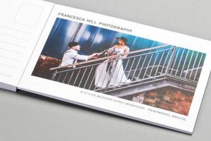
Creating an effective postcard involves a thoughtful blend of visual elements and concise messaging. A successful design considers the target audience, the purpose of the communication (e.g., promotional, informational, personal), and the desired action. For instance, a postcard advertising a local bakery might feature enticing images of pastries and clearly display contact information and address.
Well-designed postcards offer a tangible and often memorable way to connect with recipients. Their compact format encourages quick consumption of information, while the visual nature can capture attention effectively. Historically, postcards served as a crucial means of both personal and commercial correspondence, and their enduring popularity underscores their continued relevance in modern communication strategies.
The following sections delve into the key aspects of postcard creation, covering topics such as image selection, typography, layout, and printing considerations. Each element contributes significantly to the overall impact and efficacy of the final product.
Tips for Postcard Design
Effective postcard design requires careful consideration of several factors. The following tips offer guidance for creating impactful and successful postcards.
Tip 1: Define a Clear Objective. Establish the primary goal of the communication. Is it to drive sales, promote an event, or simply share information? A well-defined objective guides design choices.
Tip 2: Know the Target Audience. Understanding the target demographic informs design decisions related to imagery, language, and overall aesthetic. A postcard aimed at teenagers will likely differ significantly from one targeting senior citizens.
Tip 3: Select High-Quality Images. Compelling visuals are crucial. Images should be high-resolution and relevant to the message. Professional photography is recommended whenever possible.
Tip 4: Utilize Effective Typography. Font choices impact readability and convey a specific tone. Select fonts that are legible and align with the overall design aesthetic. Limit the number of different fonts used.
Tip 5: Prioritize Clear Messaging. Concise and impactful language is essential. Communicate the key message quickly and clearly, avoiding jargon or overly complex sentences.
Tip 6: Incorporate a Call to Action. Encourage a specific action from the recipient. This might involve visiting a website, making a purchase, or attending an event. Make the call to action clear and prominent.
Tip 7: Consider Professional Printing. Professional printing ensures high-quality reproduction of the design. Choose a printing service that offers suitable paper stock and finishing options.
By implementing these tips, one can create postcards that effectively communicate the intended message and achieve the desired results.
The concluding section will summarize the key takeaways and offer final recommendations for successful postcard design execution.
1. Planning
Effective postcard design begins with thorough planning. This crucial initial stage sets the foundation for all subsequent design choices and significantly impacts the final product’s success. Without a well-defined plan, even the most visually appealing postcard may fail to achieve its intended objective.
- Objective Definition
Clearly defining the postcard’s purpose is paramount. Whether the goal is to promote a sale, announce an event, or drive website traffic, a specific objective provides direction for design elements. A postcard promoting a music festival, for instance, would likely feature different imagery and messaging than one advertising a dental clinic.
- Target Audience Identification
Understanding the target demographic informs design choices. Factors such as age, interests, and lifestyle influence the selection of visuals, language, and overall aesthetic. A postcard aimed at retirees might prioritize larger font sizes and classic imagery, while one targeting young adults might employ bolder graphics and trendier language.
- Budget Determination
Establishing a budget early in the planning process helps manage costs associated with design, printing, and distribution. Budget considerations influence decisions regarding paper stock, printing techniques, and quantity. A smaller budget might necessitate simpler design choices and a smaller print run.
- Content Strategy
Developing a clear content strategy ensures the postcard communicates the intended message effectively. This involves determining key information, crafting concise and impactful copy, and selecting appropriate visuals. A postcard for a real estate agent, for example, might showcase property images, key features, and contact information.
These planning facets work in concert to shape the overall design direction. A well-defined objective informs the target audience analysis, which in turn influences the budget allocation and content strategy. By addressing these elements during the planning phase, one lays the groundwork for a successful and impactful postcard design.
2. Visuals
Visual elements play a critical role in postcard design, significantly impacting recipient engagement and message conveyance. Visuals serve as the primary means of capturing attention and communicating information quickly and effectively. The careful selection and arrangement of images, graphics, and typography contribute significantly to a postcard’s overall impact. For example, a postcard for a photography exhibition might utilize a striking image to showcase the artist’s work, immediately drawing the viewer in and conveying the exhibition’s theme. Conversely, a postcard for a political campaign might employ bold graphics and colors to convey a specific message or evoke a particular emotion.
The interplay between imagery and typography is crucial. High-quality images, whether photographs or illustrations, should be relevant to the message and target audience. Typography choices must complement the imagery and ensure readability. Font styles, sizes, and colors contribute to the overall aesthetic and convey a specific tone. For example, a postcard advertising a luxury spa might use elegant script fonts and calming imagery to create a sense of tranquility, while a postcard for a rock concert might utilize bold, edgy fonts and vibrant imagery to convey energy and excitement.
Effective visual design considers the postcard’s limited space. Visual hierarchy, achieved through size, color, and placement, guides the recipient’s eye through the information. Key elements, such as the call to action, should be visually prominent. Whitespace, used strategically, prevents visual clutter and enhances readability. Understanding the principles of visual communication is essential for creating postcards that are not only aesthetically pleasing but also effectively communicate the intended message and achieve the desired outcome.
3. Messaging
Messaging constitutes a critical component of effective postcard design. The conveyed message determines the postcard’s success in achieving its objective, whether driving sales, promoting an event, or disseminating information. Strategic messaging considers the target audience and desired outcome, ensuring clarity, conciseness, and impact.
- Clarity
Clear communication is paramount. Messages should be easily understood, avoiding jargon or ambiguity. Direct language and concise sentences facilitate comprehension. For instance, a postcard announcing a store opening should clearly state the date, time, and location, avoiding vague phrases or unnecessary details.
- Conciseness
Brevity is key in postcard messaging. Limited space necessitates concise language. Key information should be conveyed succinctly, maximizing impact. A postcard promoting a discount offer should state the discount percentage and applicable items directly, avoiding lengthy explanations or convoluted terms.
- Call to Action
An effective call to action prompts the recipient to take a specific step. This might involve visiting a website, making a purchase, or attending an event. Clear and concise instructions facilitate the desired action. A postcard advertising a webinar should include a clear registration link and instructions, making it easy for recipients to participate.
- Tone and Voice
The message’s tone and voice should align with the brand and target audience. A formal tone might suit a professional service, while a more casual tone might be appropriate for a retail promotion. A postcard from a law firm, for example, might adopt a formal and professional tone, while a postcard for a local brewery might employ a more relaxed and conversational voice.
These messaging facets contribute significantly to a postcard’s overall effectiveness. Clear and concise language, combined with a compelling call to action and appropriate tone, ensures the message resonates with the target audience and achieves the desired outcome. Careful consideration of these elements during the design process maximizes the postcard’s impact and potential for success.
4. Layout
Layout significantly impacts the effectiveness of postcard design. A well-organized layout guides the recipient’s eye through the information, ensuring key messages are easily absorbed. Visual hierarchy, achieved through strategic placement and sizing of elements, prioritizes crucial information, such as the call to action. Conversely, a poorly planned layout can confuse the recipient, diminishing the postcard’s impact. Consider a postcard for a restaurant: a clear layout might position an enticing food image prominently, followed by the restaurant’s name, address, and contact details, then a special offer or discount code. This logical flow ensures recipients quickly grasp the key information and are more likely to act on the offer.
Effective layout utilizes whitespace strategically. Sufficient spacing between elements prevents visual clutter and enhances readability. Margin considerations also contribute to a professional and visually appealing design. Imagine a postcard crammed with text and images, leaving little breathing room. This cluttered presentation overwhelms the recipient and makes it difficult to discern the key message. In contrast, a postcard with balanced whitespace allows each element to stand out, creating a more engaging and impactful experience. Practical application involves balancing visual elements with text, ensuring clear navigation and prioritizing key information.
Layout considerations are integral to successful postcard design. A well-structured layout enhances communication, strengthens visual appeal, and improves the likelihood of achieving the desired outcome. Challenges include adapting layouts for different postcard sizes and orientations. Understanding the principles of visual hierarchy, whitespace utilization, and information flow enables the creation of postcards that are both visually engaging and effective communication tools.
5. Printing
Printing represents the culmination of the postcard design process, transforming digital creations into tangible marketing materials. The printing process directly impacts the final product’s quality, influencing how recipients perceive the message and the overall effectiveness of the postcard campaign. Consider a postcard designed with vibrant colors and high-resolution images. If printed on low-quality paper with a subpar printing process, the colors may appear dull, the images blurry, and the overall impression unprofessional, potentially undermining the intended message. Conversely, high-quality printing enhances the design, ensuring the vibrancy of colors, the sharpness of images, and a professional finish that reinforces the message’s credibility. The choice of printing method, paper stock, and finish directly correlates with the perceived value and professionalism of the postcard.
Several printing techniques exist, each offering distinct advantages and disadvantages. Offset printing, known for its high-quality output and cost-effectiveness for large print runs, suits mass postcard campaigns. Digital printing, offering greater flexibility for smaller quantities and variable data printing, proves advantageous for targeted or personalized campaigns. Understanding these distinctions allows informed decisions aligned with specific project requirements and budget constraints. Selecting the appropriate paper stock is equally crucial. Paper weight, texture, and finish contribute to the postcard’s tactile appeal and overall impression. A glossy finish might enhance the vibrancy of images for a photography studio’s promotional postcard, while a matte finish might convey a more sophisticated aesthetic for an art gallery’s invitation. These choices must align with the overall design aesthetic and target audience.
Careful consideration of the printing process is essential for successful postcard design execution. The interplay between design choices and printing techniques directly influences the final product’s quality and effectiveness. Challenges include managing print costs, ensuring color accuracy, and selecting appropriate paper stock. Successfully navigating these challenges results in a tangible representation of the design that effectively communicates the intended message and achieves the desired impact. Ignoring printing considerations can undermine even the most brilliant design, highlighting the integral role of printing in the overall success of a postcard campaign.
Frequently Asked Questions
This section addresses common inquiries regarding postcard design, providing concise and informative responses to facilitate effective postcard creation.
Question 1: What are standard postcard dimensions?
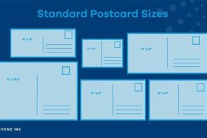
Common postcard sizes include 4″ x 6″, 5″ x 7″, and 5.5″ x 8.5″. The choice depends on design requirements and postal regulations.
Question 2: Which software is recommended for postcard design?
Professional design software such as Adobe Photoshop and InDesign offers robust features. User-friendly options like Canva are suitable for less complex designs.
Question 3: How can one ensure postcard readability?
Legible fonts, appropriate font sizes, and sufficient contrast between text and background enhance readability. Avoid overcrowding the design with excessive text.
Question 4: What is the importance of a call to action?
A call to action prompts recipients to take a specific action, such as visiting a website or making a purchase, driving engagement and achieving campaign objectives.
Question 5: How does paper stock affect postcard quality?
Paper stock choice impacts the postcard’s look and feel. Thicker stock conveys quality, while different finishes, such as matte or gloss, affect visual presentation.
Question 6: What are common mistakes to avoid in postcard design?
Common pitfalls include cluttered layouts, illegible fonts, unclear calls to action, and neglecting target audience considerations. Addressing these aspects optimizes design effectiveness.
Understanding these frequently asked questions facilitates informed design decisions and contributes to creating effective and impactful postcards.
The next section will offer concluding insights and practical tips for successful postcard design implementation.
Conclusion
Effective postcard design necessitates a strategic approach encompassing planning, visual execution, compelling messaging, thoughtful layout, and meticulous printing considerations. Each element contributes significantly to the overall impact and effectiveness of the final product. From defining clear objectives and understanding the target audience to selecting appropriate imagery, typography, and paper stock, every decision shapes the postcard’s ability to communicate and engage. A well-designed postcard serves as a powerful marketing tool, capable of driving conversions, promoting events, and building brand awareness.
The enduring relevance of postcards in modern communication underscores the importance of mastering the art of postcard design. By understanding and applying these principles, one can harness the power of this tangible medium to connect with audiences and achieve communication objectives. Effective postcard design transcends mere aesthetics; it represents a strategic investment in impactful communication.


