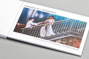
Original and visually appealing mail pieces leverage typography, imagery, and layout to effectively communicate a message or evoke a specific feeling. A well-executed piece can be a miniature work of art, promoting an event, a business, or simply serving as a memorable personal correspondence. Consider a travel postcard showcasing a stunning photograph paired with elegant, location-specific typography: this exemplifies the potential impact.
Effective visual communication in this format offers numerous advantages. Memorable postcards can strengthen brand identity, generate interest in products or services, and foster a sense of connection with recipients. Historically, these compact forms of communication have played a significant role in advertising, tourism, and personal expression, evolving alongside advancements in printing technologies and artistic trends. Their tangible nature contributes to lasting impact in a digital age.
The following sections will explore specific elements of compelling mail piece creation, covering topics such as design principles, printing techniques, and successful examples from various sectors.
Tips for Effective Postcard Design
Strong postcard designs capture attention and effectively convey their message. The following tips offer guidance for creating impactful mail pieces.
Tip 1: Define a Clear Objective. Before commencing the design process, establish the primary goal. Is the objective to promote a sale, announce an event, or simply share a visual story? A well-defined purpose informs design choices.
Tip 2: Know the Target Audience. Design aesthetics should resonate with the intended recipients. Understanding their preferences and demographics ensures the message connects effectively.
Tip 3: Prioritize High-Quality Imagery. Compelling visuals are crucial. Professional photographs or thoughtfully crafted illustrations significantly elevate the postcard’s impact.
Tip 4: Utilize Effective Typography. Font selection should complement the imagery and enhance readability. Clear, concise messaging ensures the recipient quickly grasps the key information.
Tip 5: Consider the Card Stock. The choice of paper stock influences the overall impression. A heavier stock conveys quality and durability, while textured options add a tactile element.
Tip 6: Employ White Space Strategically. Avoid overcrowding the design. Sufficient white space around elements improves readability and visual appeal.
Tip 7: Incorporate a Call to Action. If the goal is to drive a specific action, include a clear and concise call to action, such as visiting a website or using a promotional code.
Tip 8: Test Before Printing. Before committing to a large print run, test the design by printing a small batch. This allows for final adjustments and ensures the desired outcome.
By implementing these recommendations, one can create postcards that are both visually appealing and effective communication tools.
The concluding section will offer additional resources and inspiration for further exploration of postcard design principles.
1. Visual Appeal
Visual appeal forms the cornerstone of effective postcard design. A visually engaging postcard captures attention amidst competing stimuli, encouraging further interaction with the content. This connection between aesthetics and engagement underscores the importance of thoughtful visual design.
- Imagery
High-quality, relevant imagery serves as the primary visual anchor. A striking photograph, a captivating illustration, or even a well-placed graphic can immediately draw the viewer in. Consider a travel postcard showcasing a breathtaking landscapethe image instantly transports the recipient, sparking interest and a desire to learn more. The selection of imagery should align with the overall message and target audience.
- Typography
Typography plays a crucial role in visual appeal and information hierarchy. Font choices should complement the imagery and enhance readability. Elegant scripts might suit a wedding invitation, while bold sans-serif fonts might be more appropriate for a product promotion. Legibility and visual harmony are paramount. Overly ornate or clashing fonts can detract from the overall design and hinder communication.
- Color Palette
Color palettes evoke specific emotions and associations. Vibrant colors can convey energy and excitement, while muted tones suggest sophistication or tranquility. A postcard for a summer music festival might employ a bright, energetic palette, whereas a museum exhibition announcement might utilize a more subdued and elegant color scheme. Color consistency and contrast contribute significantly to the overall aesthetic impact.
- Composition & Layout
Effective composition guides the viewer’s eye through the design. Strategic placement of elements, use of white space, and a clear visual hierarchy enhance readability and create a sense of balance. A cluttered layout can overwhelm the recipient, while a well-organized design facilitates information processing. Principles of design, such as the rule of thirds, can further enhance visual appeal and create a more dynamic composition.
These interconnected facets of visual appeal contribute significantly to a postcard’s effectiveness. A harmonious interplay of imagery, typography, color, and composition enhances engagement, ensuring the message resonates with the intended audience and achieves its communication objectives. By carefully considering these elements, postcards transform from simple mail pieces into powerful tools for visual communication.
2. Clear Messaging
Clear messaging is paramount in creative postcard design. While visual appeal captures attention, a concise and easily understood message ensures the postcard achieves its communicative purpose. A visually stunning postcard with ambiguous messaging fails to effectively connect with the audience. This direct link between clarity and impact necessitates careful consideration of content hierarchy, language, and overall communicative intent.
Consider a postcard promoting a limited-time offer. A visually appealing design might attract initial interest, but if the terms of the offer, the timeframe, or the call to action are unclear, the recipient is unlikely to respond. Conversely, a postcard with a clear, concise message outlining the offer’s benefits, expiry date, and a straightforward call to action, even with a simpler design, stands a greater chance of conversion. Real-world examples demonstrate the effectiveness of prioritising clear communication. Successful marketing campaigns often utilize postcards with strong visuals supporting a concise, targeted message, demonstrating the symbiotic relationship between aesthetics and clarity.
Effective communication relies on conveying the intended message quickly and accurately. In the context of postcard design, this requires careful consideration of language, typography, and layout. Concise language, legible fonts, and a clear visual hierarchy ensure the recipient readily grasps the key information. Challenges arise when designers prioritize aesthetics over clarity, leading to visually appealing postcards that fail to communicate effectively. Integrating clear messaging within a creative design framework enhances the postcard’s overall impact and contributes to successful communication outcomes.
3. Target Audience
Understanding the target audience is crucial for effective postcard design. Design choices that resonate with one demographic may not connect with another. Aligning design elements with the target audience’s preferences, interests, and demographics ensures the postcard’s message effectively reaches and engages the intended recipients. This connection between audience understanding and design effectiveness underscores the importance of target audience analysis in the creative process.
- Demographics
Demographics, such as age, gender, location, and socioeconomic status, provide foundational insights into the target audience. A postcard targeting retirees might utilize larger fonts and classic imagery, while a postcard aimed at young adults might employ bold graphics and trendy language. Accurately defining demographics enables tailored design choices that enhance the postcard’s relevance and impact.
- Psychographics
Psychographics delve into the target audience’s values, interests, lifestyles, and attitudes. A postcard promoting an eco-friendly product might feature natural imagery and emphasize sustainability, appealing to environmentally conscious consumers. Understanding psychographic profiles allows for more nuanced design choices that connect with the target audience on a deeper level.
- Consumer Behavior
Analyzing consumer behavior, including purchasing habits, media consumption, and brand preferences, informs strategic design decisions. A postcard targeting frequent online shoppers might incorporate a QR code linking directly to a product page, facilitating seamless purchasing. Insights into consumer behavior enable the integration of design elements that align with the target audience’s existing habits and preferences.
- Communication Preferences
Understanding the target audience’s preferred communication channels and styles further refines design choices. A postcard targeting a tech-savvy audience might incorporate digital elements, such as augmented reality features, while a postcard aimed at a more traditional audience might prioritize clear, concise messaging and classic design aesthetics. Tailoring communication style enhances message reception and engagement.
By thoroughly analyzing the target audience through these facets, postcard designs can be optimized for maximum impact. Understanding demographics, psychographics, consumer behavior, and communication preferences ensures the postcard resonates with the intended recipients, leading to increased engagement and more successful communication outcomes. This targeted approach transforms the postcard from a generic mail piece into a personalized communication tool, enhancing its effectiveness and achieving desired results.
4. Quality Printing
Quality printing is integral to realizing the full potential of creative postcard design. A thoughtfully crafted design loses its impact if reproduced with subpar printing techniques. The tactile and visual quality of the printed piece directly influences recipient perception, impacting engagement and overall effectiveness. High-quality printing elevates the design, conveying professionalism and reinforcing the intended message. This connection between print quality and design impact necessitates careful consideration of printing techniques and material choices.
- Paper Stock
Paper stock significantly influences the overall impression. A heavier, premium stock conveys quality and durability, enhancing the perceived value of the postcard. Conversely, thin, flimsy stock can diminish the impact, even with a strong design. Choosing the appropriate paper weight and finishmatte, gloss, or texturedenhances the tactile experience and complements the visual elements. A luxury hotel might choose a thick, textured stock with a subtle embossing to convey elegance, while a local bakery might opt for a lighter, recycled stock to align with a brand image of sustainability.
- Color Accuracy
Accurate color reproduction is essential for conveying the intended visual message. Variations in color can drastically alter the design’s impact, potentially misrepresenting brand colors or distorting photographic elements. A postcard showcasing vibrant product photography requires precise color matching to accurately portray the product’s appearance. Inconsistent or inaccurate color reproduction can detract from the design’s credibility and impact its effectiveness. Professional printing services utilize calibrated equipment to ensure color fidelity, maintaining the integrity of the original design.
- Printing Techniques
Different printing techniques yield varying results. Offset printing provides high-quality, consistent results for large print runs, while digital printing offers flexibility for smaller quantities and personalized elements. Specialty printing techniques, such as letterpress or foil stamping, can add a unique tactile and visual dimension, further enhancing the postcard’s appeal. Choosing the appropriate printing technique depends on factors such as budget, quantity, and desired finish. A limited-edition art print might benefit from the intricate detail and tactile quality of letterpress printing, while a mass-market promotional postcard might be more effectively produced using offset printing.
- Finishing Options
Finishing options, such as UV coating, lamination, or die-cutting, further enhance the postcard’s visual and tactile qualities. A UV coating adds a protective layer and enhances the vibrancy of colors, while lamination provides durability and a smooth finish. Die-cutting allows for custom shapes and intricate details, adding a unique element to the postcard’s design. These finishing touches contribute to the overall perceived quality and can significantly enhance the recipient’s experience. A postcard for a high-end fashion brand might utilize a spot UV coating to highlight specific design elements and create a luxurious feel.
These interconnected elements of quality printing contribute significantly to the overall effectiveness of creative postcard design. By carefully considering paper stock, color accuracy, printing techniques, and finishing options, designers ensure that the final printed piece effectively represents the design intent and resonates with the target audience. A well-printed postcard not only communicates a message but also conveys a sense of professionalism and quality, enhancing brand perception and maximizing the impact of the design.
5. Call to Action
A compelling call to action (CTA) is a crucial element of effective creative postcard design. While visually appealing design and clear messaging capture attention and communicate information, a well-crafted CTA directs the recipient towards the desired next step. Without a clear CTA, the postcard’s potential impact diminishes. The CTA bridges the gap between communication and conversion, transforming a visually engaging piece into a results-driven marketing tool. This direct link between the CTA and campaign objectives necessitates careful consideration of its placement, wording, and alignment with overall design.
- Clarity and Conciseness
A strong CTA is clear, concise, and easily understood. Ambiguous or overly complex language can confuse the recipient and diminish the likelihood of conversion. Phrases such as “Visit our website today!” or “Call now for a free consultation!” provide clear instructions, leaving no room for misinterpretation. Vague phrasing like “Learn more” or “Get started” lacks the directness needed to effectively motivate action. Real-world examples demonstrate the effectiveness of clear CTAs; marketing campaigns utilizing concise, action-oriented language often yield higher conversion rates. Conversely, campaigns with unclear CTAs frequently underperform, highlighting the importance of clarity in driving desired outcomes.
- Placement and Visibility
Strategic placement ensures the CTA is readily visible and easily accessible. Positioning the CTA prominently on the postcard, using visual cues like arrows or contrasting colors, draws the recipient’s attention. Burying the CTA within a cluttered design or placing it in an inconspicuous location reduces its effectiveness. Consider a restaurant promotion postcard: placing the CTA”Order online now!”with a prominent online ordering link near the bottom right corner ensures easy access and encourages immediate action. Effective placement leverages visual hierarchy and design principles to guide the recipient towards the desired action.
- Incentive and Value Proposition
A compelling CTA often incorporates an incentive or highlights the value proposition. Offering a discount, a free gift, or emphasizing the benefits of taking action increases the recipient’s motivation to respond. A bookstore postcard might include a CTA like “Sign up for our newsletter and receive 10% off your next purchase!” This incentivized approach provides tangible value and encourages immediate engagement. CTAs lacking an incentive or clear value proposition may not effectively persuade recipients to take the desired action. Emphasizing the benefits strengthens the CTA’s persuasive power and increases the likelihood of conversion.
- Alignment with Design and Target Audience
The CTA should seamlessly integrate with the overall postcard design and resonate with the target audience. A CTA’s tone and language should align with the design’s aesthetic and the target audience’s preferences. A postcard targeting a younger demographic might utilize informal language and a bold design, while a postcard aimed at a more mature audience might employ a more formal tone and a classic design. A disconnect between the CTA, design, and target audience can diminish the postcard’s effectiveness. Alignment ensures the CTA complements the overall design and effectively connects with the intended recipients.
These interconnected facets of a compelling CTA contribute significantly to the overall success of creative postcard design. By carefully considering clarity, placement, incentive, and alignment with the target audience, designers transform a visually appealing postcard into a powerful tool for driving desired outcomes. A well-crafted CTA seamlessly integrates with the overall design, guiding the recipient towards the intended action and maximizing the postcard’s effectiveness. This strategic approach elevates the postcard beyond a simple communication piece, transforming it into a dynamic element within a broader marketing strategy.
Frequently Asked Questions
This section addresses common inquiries regarding the development and execution of effective postcard campaigns.
Question 1: What are the standard postcard sizes?
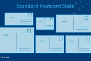
Common postcard sizes include 4″ x 6″, 5″ x 7″, and 6″ x 9″. The choice depends on design complexity and budget considerations. Larger sizes offer greater visual impact but incur higher printing costs.
Question 2: How does one choose appropriate imagery?
Imagery should align with the overall message and target audience. High-resolution, professional photographs or thoughtfully crafted illustrations are essential for conveying quality and capturing attention. Stock photos can be a cost-effective option, but ensure they align with brand aesthetics and avoid generic visuals.
Question 3: What are key typographic considerations?
Font selection should prioritize readability and complement the overall design. Limit the number of fonts used to maintain visual consistency. Ensure sufficient contrast between text and background colors for optimal legibility. Font sizes should be appropriate for the chosen postcard size and viewing distance.
Question 4: How can one ensure print quality?
Collaborating with a reputable printer is crucial. Requesting print samples allows for evaluation of paper stock, color accuracy, and finishing options before committing to a full print run. Providing print-ready files in the correct format minimizes potential errors and ensures optimal results.
Question 5: What is the role of a call to action?
A call to action prompts the recipient to take a specific action, such as visiting a website, making a purchase, or attending an event. Clear, concise wording and prominent placement are essential for maximizing conversion rates. Incentivizing the desired action can further enhance effectiveness.
Question 6: How can one measure the effectiveness of a postcard campaign?
Tracking mechanisms, such as unique promotional codes or dedicated landing pages, enable measurement of campaign performance. Analyzing response rates and conversion data provides insights into campaign effectiveness and informs future design and distribution strategies.
Careful consideration of these frequently asked questions provides a foundation for developing and executing impactful postcard campaigns. Strategic planning, thoughtful design, and meticulous execution contribute to successful outcomes.
The following section offers a collection of inspiring examples demonstrating successful postcard design across various industries.
Creative Postcard Design
Effective visual communication through thoughtfully designed postcards requires a strategic approach encompassing several key elements. From impactful visuals and concise messaging to a deep understanding of the target audience and high-quality printing, each component contributes to the overall success of the piece. A well-crafted call to action further amplifies engagement, transforming a visually appealing design into a results-driven communication tool. Careful consideration of these interconnected elements ensures that postcards effectively convey their intended message and achieve desired outcomes.
In an increasingly digital world, the tangible nature of a well-designed postcard offers a unique opportunity to connect with audiences on a more personal level. The ability to hold, feel, and display a physical piece contributes to its lasting impact. As communication strategies evolve, embracing the potential of creative postcard design provides a powerful means of conveying messages, strengthening brand identities, and fostering meaningful connections in a tangible and enduring way.


