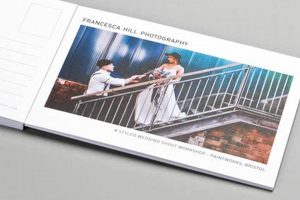
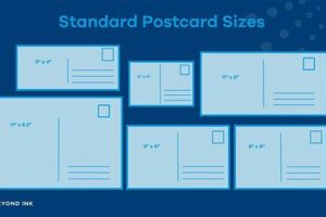
The organization of elements on a postcard, including text, images, and address blocks, is crucial for effective communication. A typical example features an eye-catching image on one side and designated spaces for a recipient’s address, postage, and a personal message on the other. Various arrangements exist, accommodating diverse purposes from advertising and announcements to personal correspondence.
A well-considered arrangement maximizes visual impact, ensures readability, and conveys professionalism or personal style. Historically, standardized formatting facilitated efficient mail processing. Today, effective organization continues to be essential for capturing attention and conveying messages clearly, whether for business promotion or personal connection. This structured approach enables the swift comprehension of information and reinforces the sender’s intended message.
The following sections will explore specific design principles, provide practical tips for crafting effective arrangements, and showcase examples of impactful designs. Further discussion will cover the historical evolution of standardized formats and the adaptation of these principles to contemporary digital communication platforms.
Tips for Effective Postcard Design
Strategic placement of visual and textual elements is essential for creating impactful postcards. The following tips offer guidance on maximizing communication effectiveness.
Tip 1: Prioritize Visual Hierarchy: The most important element should immediately capture attention. A compelling image or headline positioned prominently achieves this.
Tip 2: Balance White Space: Avoid cluttered designs. Ample white space around elements enhances readability and visual appeal.
Tip 3: Choose Clear Typography: Select fonts that are easy to read, even at small sizes. Maintain consistency in font usage throughout the design.
Tip 4: Consider the Target Audience: Design choices should reflect the recipient’s demographics and interests. Visual and textual elements should resonate with the intended audience.
Tip 5: Utilize High-Quality Images: Images should be sharp, vibrant, and relevant to the message. Professional photography or high-resolution graphics enhance the overall impression.
Tip 6: Include a Clear Call to Action: If the objective is to drive a specific action (e.g., visiting a website, making a purchase), state it clearly and concisely.
Tip 7: Test Different Layouts: Experimenting with different arrangements before finalizing the design can identify the most effective visual hierarchy and balance.
By applying these principles, one can create postcards that effectively communicate the intended message, capture attention, and achieve desired outcomes.
The subsequent section offers practical examples of effective postcard designs and analyzes their strengths, providing further insights into successful implementation.
1. Visual Hierarchy
Visual hierarchy plays a crucial role in effective postcard design. It guides the viewer’s eye through the information presented, prioritizing key elements and ensuring the intended message is received. This structured approach utilizes varying sizes, colors, contrasts, and placement to establish a clear order of importance among the elements. Without a well-defined visual hierarchy, a postcard can appear cluttered and confusing, diminishing its impact and potentially leading the recipient to overlook critical information.
Consider a postcard promoting a limited-time offer. The offer itself, perhaps highlighted in a bold, large font and contrasting color, would occupy the most prominent position, immediately capturing attention. Supporting details, such as the terms and conditions or a website address, would be presented in a smaller font size and less prominent colors, ensuring they are available but not distracting from the main message. An image relevant to the offer might also be included, positioned and sized to complement the textual hierarchy. This strategic arrangement ensures the recipient quickly grasps the key takeaway and is more likely to act upon the offer.
Effective use of visual hierarchy is essential for achieving a postcard’s communicative purpose. It facilitates rapid comprehension, reinforces key messages, and enhances the overall impact. Challenges may include balancing aesthetic considerations with functional clarity, particularly when incorporating multiple elements within a limited space. However, skillful implementation of visual hierarchy principles can transform a simple postcard into a powerful communication tool.
2. Balance and Whitespace
Balance and whitespace are integral components of effective postcard layouts, significantly influencing visual appeal and message comprehension. Balance refers to the distribution of visual weight within the design, ensuring no single element overpowers others. Whitespace, the unoccupied areas surrounding elements, provides visual breathing room, preventing a cluttered appearance and enhancing readability. A harmonious interplay between these two aspects creates a visually appealing and easily digestible design. An unbalanced layout with insufficient whitespace can appear chaotic, overwhelming the recipient and diminishing the impact of the message. Conversely, a well-balanced design with strategically placed whitespace guides the eye smoothly through the information, highlighting key elements and improving overall comprehension. For instance, a postcard promoting a museum exhibition might feature a captivating image on one side, balanced by concise text and ample whitespace on the other, ensuring both visual appeal and clear communication of essential details.
The practical application of balance and whitespace principles varies depending on the postcard’s purpose. A marketing postcard might prioritize a prominent call to action, balanced by supporting visuals and concise text, with strategic whitespace guiding the recipient towards the desired action. An informational postcard, however, might require a more even distribution of elements, with balanced text blocks and ample whitespace ensuring comfortable readability. Consider a historical society’s postcard announcing an upcoming lecture series. Balanced text blocks detailing the lectures, accompanied by relevant historical images and sufficient whitespace, would create an informative and visually appealing layout, encouraging recipient engagement. Neglecting balance and whitespace principles can lead to ineffective communication. Overcrowded designs can overwhelm recipients, while unbalanced layouts can distract from the intended message.
Strategic use of balance and whitespace enhances a postcard’s effectiveness. Creating a visually appealing and easily digestible layout promotes engagement and facilitates information processing. Challenges include achieving balance within a limited space and tailoring whitespace usage to specific content and target audiences. However, mastering these principles allows the creation of postcards that are both visually captivating and effective communication tools. These considerations are crucial for maximizing the impact of any postcard design.
3. Typography and Legibility
Typography and legibility are fundamental to effective postcard layouts. Typefaces and their arrangement significantly impact readability and overall message conveyance. Careful selection and arrangement of fonts ensure the intended message is easily understood. Illegible text, resulting from poor font choices or overcrowding, renders the postcard ineffective, regardless of other design elements. Font size, style, spacing (kerning and leading), and color contrast against the background all contribute to legibility. A postcard announcing a concert, for instance, might use a bold, easily readable font for the band’s name and date, while employing a lighter, smaller font for supporting details. This hierarchy ensures key information is readily accessible, while supplementary information remains available without overwhelming the design. Conversely, a postcard with ornate, difficult-to-read fonts or insufficient contrast between text and background hinders comprehension and diminishes engagement.
Practical considerations for typography include the postcard’s purpose and target audience. Formal announcements might benefit from traditional serif fonts, while promotional materials might employ modern sans-serif fonts to project a contemporary image. Font sizes should be adjusted according to the length of the text and the viewing distance. Postcards viewed at arm’s length require larger fonts than those intended for close-up reading. Color contrast is paramount. Dark text on a light background, or vice versa, ensures readability. Insufficient contrast, such as light gray text on a white background, impedes comprehension. A travel postcard might utilize a vibrant, high-contrast color scheme for text against a scenic photograph, ensuring location names and key details are easily discernible. These considerations ensure the message reaches the recipient effectively.
Legible typography is essential for conveying information effectively. Challenges include balancing aesthetic preferences with optimal readability and adapting typography to diverse audiences and purposes. Understanding the interplay between typography, legibility, and overall design contributes significantly to postcard effectiveness. A well-chosen typeface, appropriately sized and arranged, ensures clear communication and maximizes the postcard’s impact. This understanding reinforces the importance of typographic considerations in achieving successful communication through the postcard medium.
4. Imagery and Messaging
The interplay between imagery and messaging is crucial for effective postcard layouts. Visuals and text must work synergistically to convey the intended message clearly and compellingly. Strategic image selection and placement, combined with concise and impactful messaging, significantly influence recipient engagement. A disconnect between these elements can lead to confusion and diminish the postcard’s effectiveness. For example, a postcard promoting a nature preserve might feature breathtaking landscape photography paired with concise text highlighting key features and visitor information. This synergy creates a cohesive and compelling message, encouraging exploration. Conversely, an image unrelated to the accompanying text creates dissonance, confusing the recipient and undermining the intended message. The relationship between imagery and messaging directly impacts how effectively a postcard communicates its purpose.
Practical application requires careful consideration of the target audience and the postcard’s objective. Marketing postcards often prioritize visually appealing imagery designed to capture attention, coupled with persuasive messaging that encourages a specific action. Informational postcards, on the other hand, may prioritize clear and concise text, supported by relevant imagery that enhances understanding. A postcard announcing a photography exhibition, for example, might showcase a selection of compelling photographs, accompanied by concise details about the exhibition dates, times, and location. This approach informs the recipient while simultaneously showcasing the quality of the exhibited work. The selection and placement of images, alongside the tone and style of the messaging, should align with the overall communication goals. Visuals should reinforce and amplify the written message, creating a cohesive and impactful experience for the recipient. This integrated approach maximizes the postcard’s potential to engage and inform.
Effective integration of imagery and messaging is essential for successful postcard design. Challenges include selecting appropriate imagery, crafting concise and compelling text, and ensuring a harmonious relationship between the two within the limited postcard space. Overcoming these challenges requires careful planning and execution. Understanding the interplay between visual and textual elements allows for the creation of postcards that are not only visually appealing but also effectively communicate their intended message. This understanding highlights the integral role of imagery and messaging in maximizing the impact of a postcard as a communication tool. By effectively combining compelling visuals with concise and relevant messaging, postcard designs can successfully capture attention, convey information, and achieve their intended communication objectives.
5. Address and Postage Clarity
Address and postage clarity are critical components of effective postcard layouts. A postcard’s primary function is communication, which requires successful delivery. Even with compelling visuals and messaging, a postcard fails its purpose if it doesn’t reach the intended recipient. Legible recipient addresses and correctly placed, adequately sized postage areas are essential. These elements must integrate seamlessly within the overall layout without disrupting the design’s aesthetic or communicative flow. A postcard featuring a cluttered address area or insufficient space for postage may face delivery delays or even return to sender. Consider a business distributing promotional postcards: an unclear address, even with a compelling offer, renders the campaign ineffective, wasting resources and potentially damaging brand perception. Conversely, a clearly defined address block facilitates efficient processing and delivery, maximizing the campaign’s reach and impact.
Practical application requires a balance between functionality and aesthetics. Address blocks should be sufficiently large to accommodate varying handwriting styles and international address formats. Placement should be strategic, typically on the right-hand side of the postcard, adhering to postal regulations and ensuring efficient processing. Postage areas should be clearly marked and adequately sized to accommodate various stamp formats. Designers often incorporate designated boxes or outlines to delineate these areas, maintaining visual clarity while ensuring functionality. Examples include using contrasting background colors or subtle borders to distinguish the address and postage areas from the main design elements. This approach ensures these crucial components are easily identifiable without detracting from the overall aesthetic. Integrating these practical considerations into the design process, rather than treating them as afterthoughts, demonstrates professionalism and attention to detail.
Clear addressing and postage are fundamental to a postcard’s functionality. Challenges include balancing these practical necessities with aesthetic considerations and adapting layouts to accommodate diverse address formats and postal regulations. However, prioritizing these elements ensures successful delivery and maximizes the postcard’s communication potential. Overlooking these seemingly minor details can undermine even the most meticulously crafted designs. Therefore, address and postage clarity are not merely practical necessities but integral aspects of effective postcard layout, directly contributing to the successful fulfillment of its communicative purpose.
Frequently Asked Questions
This section addresses common inquiries regarding effective postcard layouts, providing concise and informative responses.
Question 1: What is the optimal ratio of image to text in a postcard layout?
The ideal ratio depends on the postcard’s purpose. Image-heavy layouts suit visually driven promotions, while text-heavy layouts are appropriate for information-rich content. A balanced approach often proves effective, ensuring visual appeal without sacrificing clarity.
Question 2: How does one select appropriate typography for a postcard?
Typeface selection should consider the target audience and the postcard’s overall tone. Formal occasions may warrant classic serif fonts, while modern designs might benefit from clean sans-serif fonts. Legibility remains paramount, regardless of stylistic choices.
Question 3: What is the importance of whitespace in postcard design?
Whitespace, or negative space, prevents a cluttered appearance. It improves readability by providing visual breathing room around elements, guiding the recipient’s eye through the information hierarchy.
Question 4: How can one ensure address and postage clarity on a postcard?
Designated areas for addresses and postage, clearly delineated through borders or contrasting backgrounds, ensure efficient processing. Adhering to postal regulations regarding placement and sizing is crucial for successful delivery.
Question 5: What are common mistakes to avoid in postcard layout?
Overcrowding, illegible fonts, and a disconnect between imagery and messaging are common pitfalls. Neglecting address and postage clarity also compromises deliverability and overall effectiveness.
Question 6: What resources are available for creating effective postcard layouts?
Numerous online resources offer design templates, tutorials, and inspiration. Professional graphic design software provides advanced tools for customization and precision. Collaboration with experienced designers ensures professional-grade results.
Understanding these frequently addressed concerns facilitates the creation of effective and impactful postcard designs, maximizing communication potential.
The following section will delve into specific case studies, analyzing successful postcard campaigns and extracting actionable insights.
Postcard Layout
Effective communication through the printed medium hinges on strategic organization. Key aspects explored include the establishment of a clear visual hierarchy, balancing elements with considered whitespace, selecting legible typography, ensuring synergy between imagery and messaging, and prioritizing address and postage clarity. Each element contributes significantly to a postcard’s overall impact, facilitating clear communication and maximizing engagement. Discussed practical applications demonstrate how these principles adapt to diverse communication goals, from promotional campaigns to personal correspondence.
Strategic visual communication remains essential in a digitally driven world. Postcard layouts, though seemingly simple, offer a potent platform for conveying messages effectively. Careful consideration of design principles empowers individuals and organizations to harness this medium’s potential, transforming a simple piece of card stock into a powerful communication tool.


