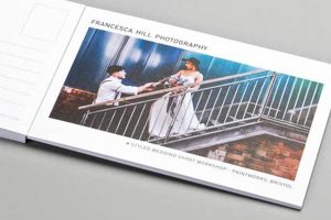
Conceptualizing visuals and layouts for postcards involves a creative process encompassing various elements such as imagery, typography, color palettes, and messaging. For instance, a travel postcard might feature a striking photograph of a landmark with elegant, minimalist text, while a promotional postcard for a business could utilize bold graphics and a clear call to action. This process aims to create a visually appealing and informative piece of mail.
Effective visuals on these compact communication tools can significantly impact recipient engagement. A well-designed piece can evoke emotions, convey information concisely, and even drive action, whether it’s encouraging a visit to a website or boosting brand recognition. Historically, postcards have served as both personal mementos and effective marketing instruments, showcasing everything from travel destinations to political campaigns, reflecting cultural trends and artistic styles of their time.
This exploration delves into the key principles of effective visual communication applied to this unique format, covering topics such as image selection, typography best practices, and strategies for achieving specific communication goals.
Tips for Effective Postcard Design
Creating impactful postcards requires careful consideration of several design elements. The following tips offer guidance for developing effective visuals that communicate clearly and achieve desired results.
Tip 1: Define a Clear Objective. Before initiating the design process, establish the postcard’s purpose. Is it intended to promote a sale, announce an event, or serve as a personal greeting? A well-defined objective will guide design choices.
Tip 2: Select High-Quality Imagery. Compelling visuals are crucial. Choose professional-grade photographs or illustrations that are relevant to the message and target audience. Images should be high-resolution to ensure sharp printing.
Tip 3: Employ Effective Typography. Font choices significantly impact readability and overall aesthetic. Select fonts that are legible and align with the overall tone and style. Limit the number of different fonts used to maintain a clean and professional appearance.
Tip 4: Utilize White Space Strategically. Avoid overcrowding the design. White space allows the eye to rest and improves the readability of text and other elements. A balanced layout enhances visual appeal.
Tip 5: Consider the Target Audience. Design choices should resonate with the intended recipients. Understanding their demographics, interests, and preferences will inform decisions regarding imagery, color palettes, and messaging.
Tip 6: Include a Clear Call to Action. If the goal is to drive a specific action, such as visiting a website or making a purchase, clearly state the desired action and provide necessary information, such as a website address or discount code.
Tip 7: Proofread Carefully. Errors in grammar or spelling can diminish credibility. Thoroughly review all text before printing to ensure accuracy and professionalism.
By implementing these design tips, one can create postcards that effectively communicate their intended message, engage the recipient, and achieve desired outcomes.
These considerations represent fundamental aspects of impactful visual communication in the postcard format. A synthesis of these elements contributes to a successful design.
1. Imagery
Visual communication relies heavily on imagery. Within the context of postcard design, image selection plays a crucial role in capturing attention, conveying messages, and evoking desired responses. Strategic image choices contribute significantly to a postcard’s overall effectiveness.
- Subject Matter Relevance
Image content should directly relate to the postcard’s purpose. A postcard promoting a travel destination, for example, benefits from showcasing scenic landscapes or local landmarks. For business promotions, product images or depictions of services offered are more appropriate. Alignment between subject matter and objective strengthens message clarity.
- Image Quality and Resolution
High-resolution images are essential for professional-looking postcards. Blurry or pixelated visuals detract from the overall design and convey a lack of attention to detail. Crisp, clear imagery enhances visual appeal and reinforces a sense of quality.
- Emotional Impact
Images evoke emotions. Selecting visuals that resonate with the target audience on an emotional level can significantly enhance engagement. A postcard promoting a relaxing vacation might feature serene beach imagery, while one advertising an adventurous excursion could showcase thrilling outdoor activities. Careful consideration of emotional impact strengthens audience connection.
- Composition and Framing
Thoughtful composition and framing enhance visual appeal and guide the viewer’s eye. Principles of photography, such as the rule of thirds and leading lines, can be employed to create dynamic and engaging visuals. Effective use of these techniques elevates the overall design aesthetic.
These facets of imagery selection contribute significantly to the overall impact of a postcard. By carefully considering subject matter relevance, image quality, emotional impact, and composition, designs can effectively communicate messages, capture attention, and achieve desired outcomes. The interplay of these elements ensures that the chosen imagery reinforces the overall design objective.
2. Typography
Typography significantly influences a postcard’s effectiveness. Font selection, size, and arrangement impact readability, convey brand personality, and contribute to the overall aesthetic. Legibility is paramount; recipients should be able to quickly and easily digest the information presented. A postcard promoting a luxury brand might utilize an elegant serif font, while a technology company might opt for a modern, clean sans-serif. For instance, a travel postcard featuring a historic site might use a traditional serif font to evoke a sense of history and timelessness, while a postcard advertising a music festival might employ a bold, modern sans-serif to project energy and excitement. The chosen typography should align with the overall message and target audience.
Beyond legibility, typographic choices contribute to the postcard’s visual hierarchy. Larger, bolder fonts draw attention to key information like headlines or calls to action, while smaller fonts are used for supporting details. Effective use of hierarchy guides the reader’s eye through the information presented. Consider a postcard advertising a sale. The sale percentage or discount code might be displayed in a large, eye-catching font, while the terms and conditions are presented in a smaller, less prominent font. This prioritization of information through typography ensures that the key message is immediately apparent.
Successful postcard design hinges on the thoughtful integration of typography with other design elements. Font choices should complement the chosen imagery and color palette to create a cohesive and visually appealing design. Overuse of fonts or excessively stylized typography can detract from readability and create a cluttered appearance. A balanced approach, prioritizing clarity and visual harmony, ensures that the typography enhances rather than hinders the overall effectiveness of the postcard. Careful consideration of these typographic principles allows for the creation of postcards that are both visually engaging and effectively communicate their intended message.
3. Color Palettes
Color palettes play a critical role in postcard design, influencing the recipient’s perception and emotional response. Careful color selection can enhance brand recognition, evoke specific moods, and guide the viewer’s attention. The relationship between color and psychological impact is well-established; specific hues evoke predictable emotional associations. For example, warm colors like red and orange can stimulate excitement and energy, while cool colors like blue and green often convey tranquility and trustworthiness. A postcard for a summer music festival might employ vibrant, energetic colors, while one promoting a spa retreat might utilize calming, natural hues.
Effective color palettes consider the target audience and the postcard’s objective. Understanding the demographics and preferences of the intended recipients informs color choices. A postcard targeting a younger demographic might utilize bolder, more saturated colors, while one aimed at a more mature audience might favor a more subdued palette. Moreover, the postcard’s purpose should dictate color selection. A postcard announcing a sale might utilize contrasting colors to highlight discounts, while one promoting a luxury product might employ a sophisticated, monochromatic scheme. A postcard advertising a children’s toy might use bright primary colors, while one promoting a high-end watch might use a palette of metallics and deep jewel tones.
Creating visually harmonious color palettes often involves adhering to color theory principles. Utilizing complementary colors, analogous colors, or triadic color schemes can create a balanced and aesthetically pleasing design. Complementary colors, situated opposite each other on the color wheel, offer high contrast and visual impact. Analogous colors, located adjacent to each other on the color wheel, create a sense of harmony and cohesion. Triadic color schemes, utilizing three colors evenly spaced on the color wheel, offer a balanced yet vibrant approach. Understanding these principles allows for the strategic use of color to enhance the postcard’s visual appeal and effectively communicate its message. Ignoring these principles can result in jarring or visually confusing designs that detract from the postcards effectiveness.
4. Layout
Layout significantly impacts the effectiveness of postcard designs. A well-planned layout guides the viewer’s eye through the information presented, creating a clear hierarchy of elements. Strategic placement of text, images, and whitespace contributes to a visually appealing and easily digestible design. Effective layouts consider the natural flow of reading, often employing a Z-pattern or other established visual paths to guide the viewer’s gaze. A poorly planned layout can result in confusion, with key information getting lost amidst clutter. Consider a postcard promoting a restaurant. Placing a mouth-watering image of a signature dish at the top, followed by the restaurant name and address, and concluding with a special offer at the bottom creates a logical flow and maximizes impact. Conversely, a cluttered layout with randomly placed elements might fail to capture attention or convey essential information effectively.
Practical application of layout principles involves balancing various design elements. Whitespace, often overlooked, plays a crucial role in enhancing readability and visual appeal. Sufficient spacing around text and images prevents a cluttered appearance, allowing individual elements to stand out. Alignment contributes to a sense of order and professionalism. Aligning text and images to a grid creates a structured and visually pleasing design. Contrast, achieved through variations in size, color, or font weight, can further enhance visual hierarchy and draw attention to key information. A postcard announcing a conference, for example, might use a bold, large font for the conference title, a smaller font for the date and location, and an even smaller font for additional details, all aligned to a grid and separated by ample whitespace for clarity. This structured approach ensures easy comprehension of the information presented.
Mastering layout in postcard design leads to enhanced communication and greater impact. A well-structured layout contributes to a positive user experience, making the information easily accessible and visually appealing. Clear visual hierarchy ensures that the recipient quickly grasps the key message, leading to increased engagement and desired outcomes. Challenges in layout often involve balancing aesthetic appeal with functionality, requiring careful consideration of the target audience, the postcard’s objective, and the interplay of various design elements. Effective layout serves as a foundation for successful postcard design, contributing to clear communication and maximizing the potential for achieving desired results.
5. Messaging
Messaging constitutes a critical component of postcard design, bridging visual elements and communication objectives. Effective messaging clarifies the postcard’s purpose, conveying information concisely and persuasively to the target audience. Strategic messaging aligns with the overall design and reinforces the desired outcome, whether driving sales, promoting events, or building brand awareness. A clear, focused message ensures the postcard’s effectiveness in achieving its communication goals.
- Clarity and Conciseness
Postcard space limitations necessitate clear, concise messaging. Unnecessary jargon or complex sentence structures should be avoided. Each word must contribute to the overall message, maximizing impact within the limited space. A postcard promoting a discount, for instance, should clearly state the offer and its terms without ambiguity. Brevity ensures quick comprehension and enhances the recipient’s engagement.
- Target Audience Relevance
Messaging should resonate with the intended audience’s interests and needs. Understanding demographics, preferences, and motivations allows for tailoring language and tone appropriately. A postcard targeting millennials might employ informal, contemporary language, while one aimed at a professional audience might adopt a more formal tone. Alignment with the target audience strengthens message relevance and increases impact. For example, a postcard for a student travel agency would use different language than a postcard promoting luxury cruises.
- Compelling Call to Action
If the objective is to elicit a specific action, a clear and compelling call to action is crucial. Direct, actionable language, such as “Visit our website,” “Call now,” or “Redeem this offer,” guides the recipient towards the desired outcome. A compelling call to action combined with relevant information, like a website address or phone number, facilitates the desired response. For example, a postcard promoting a limited-time offer would benefit from a clear call to action like Order now before its gone!.
- Alignment with Visual Elements
Messaging should complement the postcard’s visual elements. The tone of the message should align with the imagery and color palette, creating a cohesive and unified design. Incongruence between messaging and visuals can create confusion and diminish impact. A postcard with calming imagery and a pastel color palette should have a message that reflects the same tranquil tone. Conversely, a postcard featuring vibrant imagery and bold colors should convey a similarly energetic message. Visual and textual harmony reinforces the overall communication goal.
Effective messaging in postcard design hinges on the synergy between concise language, audience relevance, compelling calls to action, and visual harmony. By carefully considering these elements, postcards can effectively communicate their intended message, engage the recipient, and achieve desired outcomes. The interplay of these factors strengthens the postcard’s overall impact, transforming a simple piece of mail into a powerful communication tool.
6. Target Audience
Target audience identification represents a crucial initial step in postcard design. A clear understanding of the intended recipients informs design choices, ensuring message relevance and maximizing impact. Analyzing demographic factors, psychographics, and consumer behavior allows for tailoring design elements to resonate with the specific group, thereby increasing engagement and achieving desired outcomes. Ignoring target audience considerations risks creating visually appealing postcards that nonetheless fail to connect with the intended recipients, diminishing their effectiveness.
- Demographics
Demographic factors such as age, gender, location, education level, and income provide a foundational understanding of the target audience. These data points inform design choices related to imagery, color palettes, typography, and messaging. A postcard targeting retirees, for example, might utilize larger fonts and calming color schemes, while one aimed at young adults might employ bolder graphics and trendy typography. Accurate demographic analysis ensures visual communication aligns with audience characteristics.
- Psychographics
Psychographics delve into the target audience’s values, interests, lifestyles, and attitudes. Understanding these psychological factors allows for crafting messages and visuals that resonate with their motivations and aspirations. A postcard promoting eco-friendly products might feature natural imagery and emphasize sustainability, appealing to an environmentally conscious audience. Incorporating psychographic insights strengthens the emotional connection between the message and the recipient.
- Consumer Behavior
Analyzing consumer behavior patterns, such as purchasing habits, brand loyalty, and media consumption, provides valuable insights for tailoring postcard design. Understanding how the target audience interacts with marketing materials informs design choices related to call-to-actions, promotional offers, and distribution channels. A postcard targeting frequent online shoppers might prominently feature a website address and online discount code. Incorporating consumer behavior data enhances the postcard’s effectiveness in driving desired actions.
- Communication Preferences
Understanding the target audience’s preferred communication channels and styles contributes to a more effective campaign. Some audiences may respond better to visually driven designs, while others may prefer more text-heavy content. Recognizing these preferences allows for optimizing the postcard’s layout, imagery, and messaging for maximum engagement. A postcard targeting a visually oriented audience might prioritize striking imagery over lengthy text descriptions. Aligning communication style with audience preferences strengthens message reception.
These facets of target audience analysis collectively inform design choices, creating postcards that resonate with the intended recipients. A deep understanding of demographics, psychographics, consumer behavior, and communication preferences ensures message relevance, strengthens engagement, and ultimately maximizes the effectiveness of the postcard campaign. By tailoring design elements to the specific characteristics of the target audience, postcards become powerful tools for achieving communication objectives and driving desired outcomes.
7. Call to Action
A call to action (CTA) represents a crucial element within postcard design, directing recipients toward a specific desired action. Effective CTAs provide clear instructions and compelling incentives, prompting recipients to engage further with the promoted product, service, or event. The CTA’s effectiveness hinges on its clarity, relevance to the target audience, and integration with the overall postcard design. A well-crafted CTA transforms a visually appealing postcard into a powerful driver of customer engagement and conversions. For instance, a postcard announcing a store opening might include a CTA such as “Visit us this weekend for exclusive opening offers,” encouraging recipients to attend the event. A travel agency postcard might use a CTA like “Book your dream vacation today and receive 10% off,” incentivizing immediate booking. The CTA’s strength lies in its ability to convert passive recipients into active participants.
Practical considerations for CTA implementation within postcard design involve several key factors. Placement of the CTA plays a significant role in its visibility and effectiveness. Strategic placement, often at the end of the postcard after the value proposition has been established, maximizes prominence. Visual emphasis through contrasting colors, larger fonts, or distinct graphic elements draws attention to the CTA. Wording of the CTA should be concise, action-oriented, and create a sense of urgency or exclusivity. Limiting the number of CTAs on a single postcard prevents confusion and focuses recipient action. Including a trackable element within the CTA, such as a unique URL or promotional code, allows for measuring campaign effectiveness and calculating return on investment. A bookstore promoting a new author might include a CTA like “Pre-order your signed copy online using code AUTHOR10,” allowing for tracking pre-order sales attributed to the postcard campaign.
Challenges in CTA design frequently involve balancing clarity with conciseness. Overly long or complex CTAs can lose recipient attention, while overly brief CTAs might lack essential information. Striking this balance requires careful consideration of the target audience, the desired action, and the overall postcard design. Effectively designed CTAs contribute significantly to successful postcard campaigns, transforming static visuals into dynamic tools for driving customer engagement and achieving marketing objectives. Failure to incorporate a clear, compelling CTA can diminish the postcard’s impact, rendering a potentially effective marketing tool largely ineffective. Understanding the crucial role of the CTA and implementing best practices in its design maximizes postcard campaign potential and contributes to achieving desired business outcomes.
Frequently Asked Questions
This section addresses common inquiries regarding the development and implementation of effective postcard designs.
Question 1: What are the standard postcard dimensions?
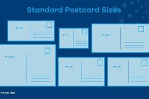
Standard postcard sizes vary by region, but common dimensions include 4″ x 6″ and 5″ x 7″. Selecting a standard size can minimize printing costs.
Question 2: How does one choose appropriate paper stock for postcards?
Paper stock selection impacts the postcard’s perceived quality and durability. A thicker stock conveys a more professional impression, while a glossy finish enhances image vibrancy. Consider the postcard’s purpose and budget when selecting paper stock.
Question 3: What are effective strategies for incorporating branding into postcard designs?
Consistent branding reinforces brand identity. Incorporating logos, brand colors, and consistent typography strengthens brand recognition. Maintaining visual cohesion across marketing materials enhances brand recall.
Question 4: How can one measure the effectiveness of a postcard campaign?
Several methods exist for measuring campaign effectiveness. Incorporating trackable elements like unique URLs or promotional codes allows for quantifying responses. Surveys and customer feedback provide additional insights into campaign reach and impact. Data analysis informs future campaign refinements.
Question 5: What are common design mistakes to avoid?
Overcrowding the design, using low-resolution images, and neglecting target audience considerations represent common pitfalls. Prioritizing clarity, visual appeal, and message relevance enhances postcard effectiveness.
Question 6: What are some cost-effective printing options for postcards?
Several printing methods cater to varying budget constraints. Online printing services often provide competitive pricing for bulk orders. Local print shops may offer personalized service and quicker turnaround times. Comparing pricing and services across various vendors aids in identifying cost-effective solutions.
Addressing these common questions provides a foundation for informed decision-making in postcard design and campaign development. Understanding these considerations contributes to maximizing postcard effectiveness and achieving desired outcomes.
The next section provides case studies illustrating successful postcard campaign implementations.
Conclusion
Effective postcard design necessitates a strategic approach encompassing various interconnected elements. Careful consideration of imagery, typography, color palettes, layout, and messaging, all tailored to a specific target audience, contributes significantly to a postcard’s success. A clear, compelling call to action further enhances recipient engagement and drives desired outcomes. Each design element plays a crucial role in conveying the intended message and achieving communication objectives.
Strategic visual communication through well-executed postcard design remains a powerful tool for businesses and individuals seeking to connect with their target audience. By understanding and implementing the principles outlined herein, postcard campaigns can effectively promote products, services, events, or simply convey personalized messages. The enduring relevance of postcards in the digital age underscores the power of tangible communication in fostering meaningful connections and achieving lasting impact.


