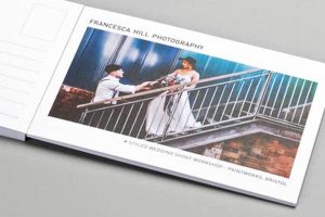
Contemporary postcard aesthetics emphasize clean lines, minimalist layouts, and bold typography, often incorporating striking photography or abstract graphics. An example would be a travel postcard featuring a single, high-quality image of a landmark with the city’s name in a sans-serif font, subtly placed. This approach contrasts sharply with the cluttered, souvenir-style designs of the past.
This evolution in visual communication reflects the broader design trends of the digital age, prioritizing clarity and impact in a visually saturated world. Effectively designed postcards offer a tangible connection in an increasingly digital landscape, standing out from email marketing and social media campaigns. They provide a unique opportunity for businesses and individuals to create a lasting impression, promote events, or simply share experiences in a personal and memorable way. Historically, postcards served primarily as a convenient correspondence tool. Their current iteration elevates them to a potent instrument for branding and creative expression.
The following sections will delve into the key elements that contribute to effective postcard design: typography choices, color palettes, image selection, and paper stock considerations. Furthermore, best practices for different postcard applications, from marketing campaigns to personal greetings, will be examined.
Tips for Effective Postcard Design
Creating impactful postcards requires careful consideration of several design elements. The following tips offer guidance for achieving a professional and visually appealing result.
Tip 1: Embrace Minimalism: Less is often more. Cluttered designs can overwhelm the viewer. Prioritize essential information and visuals for maximum impact. For example, a travel postcard might feature a single, stunning image with the location’s name in a clean, modern font.
Tip 2: Select High-Quality Imagery: Images should be sharp, high-resolution, and relevant to the message. Professional photography or thoughtfully chosen graphics significantly elevate the perceived value.
Tip 3: Utilize Strategic Typography: Font choices should complement the overall design and enhance readability. Consider using a bold sans-serif font for headings and a lighter, complementary font for body text. Legibility is paramount.
Tip 4: Implement a Cohesive Color Palette: Limit the number of colors used and ensure they complement each other and the imagery. A consistent color scheme strengthens brand identity and creates a visually harmonious design.
Tip 5: Consider the Paper Stock: The paper’s weight and texture contribute to the overall impression. A thicker stock conveys quality and durability. A matte finish can enhance the vibrancy of colors, while a glossy finish adds a touch of elegance.
Tip 6: Incorporate White Space Effectively: Negative space, or white space, is crucial for visual balance. It allows the eye to rest and prevents the design from feeling overcrowded.
Tip 7: Tailor the Design to its Purpose: A postcard promoting a sale requires a different approach than a personal greeting. Consider the target audience and the desired outcome when making design choices.
By implementing these strategies, one can create postcards that are not only visually appealing but also effectively communicate their intended message. A well-designed postcard can leave a lasting impression and achieve its communicative purpose.
In conclusion, these guidelines offer a comprehensive approach to postcard design in the modern era. By focusing on clarity, visual impact, and a strategic approach, postcards can become powerful tools for communication and branding.
1. Clean Lines
Clean lines represent a fundamental principle in contemporary postcard design, contributing significantly to a design’s overall effectiveness. They create a sense of order and sophistication, allowing the recipient to process information quickly and efficiently. This visual clarity is crucial in a world saturated with visual stimuli. A postcard with clean lines stands out from the clutter, capturing attention and conveying a sense of professionalism. For instance, a postcard promoting a minimalist furniture brand might feature a single, streamlined chair against a white background, with the company logo placed discreetly in the corner. The clean lines of the furniture itself are echoed in the layout, creating a cohesive and impactful message.
The use of clean lines facilitates a more effective hierarchy of information. By strategically using negative space and avoiding unnecessary embellishments, designers can guide the viewer’s eye to the most important elements. This might involve using lines to separate different sections of the postcard or to create a clear path to a call to action. Imagine a postcard for a photography exhibition: clean lines can be used to frame the featured photograph, separating it from the text providing event details. This separation ensures the image remains the focal point while providing clear access to essential information.
In summary, the incorporation of clean lines offers significant advantages in modern postcard design. They contribute to visual clarity, enhance information hierarchy, and project a professional image. This principle, when effectively applied, transforms a simple postcard into a powerful communication tool capable of capturing attention and conveying a message with impact and sophistication. Understanding this principle empowers designers to create postcards that are not only visually appealing but also highly effective in achieving their communicative purpose.
2. Minimalist Layout
Minimalist layout is a core tenet of modern postcard design. Its emphasis on simplicity and clarity aligns perfectly with the need for impactful communication in today’s visually saturated environment. By stripping away unnecessary elements, minimalist layouts allow key information and visuals to resonate more effectively with the recipient. This approach not only enhances aesthetic appeal but also improves comprehension and recall.
- Emphasis on Essential Elements
Minimalist layouts prioritize essential content by eliminating distractions. This focus directs the viewer’s attention immediately to the core message. For instance, a postcard announcing a product launch might feature a single, high-quality product image alongside the product name and release date. This restrained approach avoids overwhelming the recipient and ensures the key information is readily absorbed.
- Strategic Use of White Space
White space, or negative space, plays a vital role in minimalist layouts. It provides visual breathing room, preventing the design from feeling cluttered. Ample white space around text and images enhances readability and allows individual elements to stand out. A postcard for a museum exhibition might use substantial white space to isolate the title of the exhibition and the museum’s logo, creating a sense of elegance and sophistication.
- Clean Typography and Limited Color Palettes
Minimalist postcard designs typically employ clean, legible fonts and restricted color palettes. This restrained approach reinforces the overall sense of simplicity and clarity. A travel postcard might use a bold sans-serif font for the location name and a muted color palette reflecting the destination’s natural beauty. This cohesive visual language strengthens the message and enhances its impact.
- Improved Readability and Comprehension
By reducing visual clutter and emphasizing essential information, minimalist layouts improve readability and comprehension. Recipients can quickly grasp the postcard’s message without being overwhelmed by extraneous details. A postcard promoting a discount offer, for example, would benefit from a minimalist layout that clearly highlights the discount percentage and relevant dates, ensuring the recipient immediately understands the offer.
In conclusion, minimalist layouts represent a powerful approach to modern postcard design. Their emphasis on clarity, strategic use of white space, and restrained visual elements results in postcards that are not only aesthetically pleasing but also highly effective in communicating their intended message. This approach reflects a broader shift towards simplicity and functionality in design, recognizing the value of clear and concise communication in a visually complex world. By embracing minimalist principles, postcard designs can achieve maximum impact and leave a lasting impression on the recipient.
3. Bold Typography
Bold typography plays a pivotal role in contemporary postcard design, contributing significantly to its visual impact and communicative effectiveness. Its prominence stems from the need to capture attention quickly and convey key information with clarity in a visually saturated environment. Bold fonts command attention, ensuring the postcard’s primary message is immediately apparent. This visual dominance establishes a clear hierarchy of information, guiding the recipient’s eye through the design. A postcard announcing a music festival, for example, might use a bold, condensed sans-serif font for the festival name and headlining acts, instantly communicating the event’s core details.
Furthermore, bold typography contributes to the overall aesthetic of modern postcard design. Its clean lines and strong presence align with the minimalist sensibilities often favored in contemporary visuals. Bold fonts can establish a sense of modernity and sophistication, enhancing the postcard’s perceived value. The choice of typeface contributes significantly to the overall tone and style. A luxury brand might use a bold serif font to convey elegance and tradition, while a tech startup might opt for a bold geometric sans-serif font to project innovation and dynamism. A postcard promoting an art exhibition might utilize a bold, artistic font to reflect the creative nature of the event, further strengthening the connection between form and content.
In conclusion, the strategic use of bold typography is integral to effective modern postcard design. It serves not only to capture attention and convey key information efficiently but also to enhance the overall aesthetic appeal. Understanding the impact of bold typography allows designers to create postcards that are both visually compelling and communicatively effective, ensuring their message resonates with the intended audience. Selecting the appropriate typeface, weight, and size requires careful consideration, as these choices significantly influence the postcard’s overall impact and effectiveness. Therefore, a nuanced understanding of typographic principles is essential for achieving successful postcard design in the modern context.
4. High-Quality Imagery
High-quality imagery is paramount in modern postcard design. It serves as the visual cornerstone, significantly impacting the recipient’s perception and engagement. Visual appeal is often the first point of contact, influencing whether a postcard is discarded or examined further. Superior imagery elevates a postcard from a simple piece of mail to a tangible representation of quality and professionalism, reflecting positively on the sender, whether a business or individual.
- Visual Storytelling
Compelling imagery narrates a story, capturing the essence of a place, product, or event. A travel postcard featuring a breathtaking sunset over a tranquil beach instantly transports the viewer, evoking emotions and inspiring wanderlust. Similarly, a postcard showcasing a chef’s culinary creation stimulates appetite and encourages patronage. High-quality visuals communicate effectively without relying solely on text.
- Enhanced Perceived Value
Crisp, high-resolution images convey professionalism and attention to detail. They suggest that the sender values quality and invests in creating a positive impression. This perception of value extends to the message itself, increasing its perceived importance. A postcard announcing a premium product launch, for example, benefits from stunning product photography, reinforcing the message of exclusivity and quality.
- Emotional Connection
Powerful imagery evokes emotions, forging a connection with the recipient. A postcard featuring a heartwarming family photo resonates differently than one with a generic stock image. This emotional resonance enhances engagement and strengthens the message’s impact. Charitable organizations, for instance, effectively utilize impactful imagery to elicit empathy and encourage donations.
- Brand Reinforcement
Consistent use of high-quality imagery reinforces brand identity. Visuals become synonymous with the brand, increasing recognition and recall. A company known for its vibrant and modern aesthetic might use similarly styled imagery on its postcards, strengthening brand consistency and consumer recognition. This consistent visual language solidifies brand identity and enhances customer loyalty.
In summary, high-quality imagery is an indispensable element of modern postcard design. It elevates visual appeal, strengthens the message’s impact, and contributes to a positive perception of the sender. By prioritizing visual quality, postcards transcend their utilitarian function and become powerful tools for communication, brand building, and creating lasting impressions. This attention to visual detail ultimately determines the effectiveness and success of the postcard in achieving its intended purpose.
5. Strategic Color Palettes
Strategic color palettes are integral to modern postcard design, wielding considerable influence over viewer perception and engagement. Color evokes emotional responses and guides the eye, making palette selection a crucial design decision. A thoughtfully chosen palette enhances the message’s impact, reinforcing brand identity and creating a cohesive visual narrative. Consider a postcard promoting a luxury spa: a calming palette of soft blues and greens evokes tranquility and relaxation, aligning with the spa’s brand promise. Conversely, a postcard advertising a music festival might employ vibrant, energetic colors to reflect the event’s atmosphere.
Effective color palettes often adhere to established color theory principles, including complementary, analogous, and triadic color schemes. These schemes ensure color harmony and visual balance. A travel postcard showcasing a tropical destination might utilize an analogous scheme of blues and greens, reflecting the ocean and lush vegetation, creating a harmonious and visually appealing representation. Beyond aesthetics, color holds cultural significance, influencing interpretations across different demographics. Understanding these cultural nuances ensures the chosen palette resonates with the target audience. A postcard intended for a global audience requires careful color consideration to avoid unintended misinterpretations.
In summary, strategic color palette selection is essential for effective modern postcard design. It influences emotional responses, guides the viewer’s eye, and reinforces brand identity. By understanding color theory principles and cultural nuances, designers can create visually compelling and culturally sensitive postcards that achieve their communicative objectives. Careful color consideration elevates a postcard from a simple piece of mail to a sophisticated communication tool, capable of engaging the recipient and conveying a targeted message with impact and precision. Ultimately, the strategic use of color significantly contributes to the overall success and effectiveness of a postcard design.
Frequently Asked Questions
This section addresses common queries regarding contemporary postcard design, offering practical insights for effective implementation.
Question 1: How does one effectively balance visual elements and textual content in a minimalist postcard design?
Achieving balance involves prioritizing essential information and using visual hierarchy. Key elements should stand out, while supporting details are presented subtly. Ample white space prevents overcrowding and enhances readability.
Question 2: What are the recommended image resolutions for print postcards to ensure optimal clarity?
300 dpi (dots per inch) is the standard resolution for print. Lower resolutions can result in pixelation, compromising the postcard’s professional appearance. High-resolution images ensure sharp, clear visuals upon printing.
Question 3: Which paper stocks are most suitable for conveying a sense of quality and durability in postcard design?
Thicker paper stocks, such as 14-point or 16-point cardstock, convey a premium feel and enhance durability. Different finishes, like matte or gloss, further contribute to the overall impression and tactile experience.
Question 4: How can color be used strategically to evoke specific emotions or associations in postcard recipients?
Color theory offers valuable insights. Warm colors like reds and oranges evoke energy and excitement, while cool colors like blues and greens convey calmness and tranquility. Understanding color psychology allows for targeted emotional responses.
Question 5: What are some effective methods for incorporating calls to action within a minimalist postcard design without disrupting the overall aesthetic?
Calls to action should be clear and concise, using strong verbs and directing recipients towards a specific action. Placement is crucial, often positioned prominently but integrated harmoniously within the design’s layout.
Question 6: How does the choice of typography impact the overall tone and message conveyed by a modern postcard design?
Typography communicates brand personality. Clean, modern sans-serif fonts project a contemporary feel, while classic serif fonts suggest tradition and sophistication. Font choice should align with the overall brand identity and message.
Careful consideration of these elements allows for the creation of impactful and effective postcard designs in the modern context. By prioritizing visual clarity, strategic color use, and impactful typography, postcards can achieve their communicative goals effectively.
The subsequent section will delve into case studies illustrating successful modern postcard designs, offering tangible examples of these principles in action.
Modern Postcard Design
Contemporary postcard design leverages minimalist principles, strategic typography, high-quality imagery, and thoughtful color palettes to achieve maximum impact. This approach prioritizes clarity and visual appeal, ensuring the message resonates effectively in a visually saturated world. The discussed elementsclean lines, impactful visuals, and considered typographycontribute significantly to a postcard’s effectiveness as a communication tool.
The enduring relevance of tangible communication in a digital age underscores the importance of thoughtful postcard design. Effective execution transforms a simple piece of card stock into a powerful tool for brand building, event promotion, or personal connection. Continued exploration of design principles empowers both businesses and individuals to harness the potential of modern postcard design for impactful communication.


