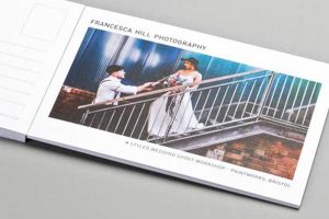
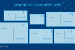
A postcard’s structure typically involves a designated area for the recipient’s address, a postage stamp, and a message space. Visual elements, such as photographs or illustrations, frequently occupy a significant portion of the surface. Standard dimensions vary by country, but common sizes include 4 x 6 inches and A6 (105 x 148 millimeters). Variations exist, encompassing larger, folded, or uniquely shaped cards.
Standardized dimensions and the division of space into distinct areas facilitate efficient processing and delivery by postal services. This structure also offers a concise and visually engaging platform for communication, whether for personal correspondence, marketing, or artistic expression. Historically, postcards have served as affordable and accessible means of sharing news and imagery across distances, contributing significantly to visual culture and social history. Their established structure played a key role in their widespread adoption and enduring popularity.
Understanding these structural elements provides a foundation for exploring specific design choices, printing techniques, and the evolution of postcard aesthetics over time. Further examination will delve into the interplay between visual and textual components and the diverse functionalities this communication medium offers.
Tips for Effective Postcard Design
Careful consideration of structural elements can significantly enhance a postcard’s impact and effectiveness. The following tips offer guidance for optimizing design choices.
Tip 1: Prioritize Clear Addressing. Legible recipient information ensures accurate and timely delivery. Sufficient space should be allocated for the address, adhering to postal regulations.
Tip 2: Maximize Visual Impact. High-quality imagery or compelling graphics capture attention and convey a message effectively. Consider professional printing techniques for optimal results.
Tip 3: Craft Concise Messaging. Limited space necessitates brevity. Focus on key information and impactful language, avoiding clutter.
Tip 4: Select Appropriate Typography. Font choices should be legible and complement the overall design. Avoid overly decorative or small fonts that hinder readability.
Tip 5: Consider Card Stock. The weight and finish of the card stock influence the perceived quality and durability. Select a stock appropriate for the intended purpose and printing method.
Tip 6: Incorporate Branding Elements (if applicable). For marketing purposes, consistent branding reinforces identity and message recall. Logos and color schemes should be integrated harmoniously.
Tip 7: Test Design Before Printing. Reviewing a physical proof before mass production allows for identification and correction of any layout or color discrepancies.
Adhering to these guidelines enhances communication effectiveness, ensures deliverability, and elevates the overall aesthetic appeal. Strategic design choices maximize the potential of this compact yet powerful communication medium.
By understanding and applying these principles, one can create postcards that effectively communicate the intended message, whether personal or promotional, and stand out within a competitive landscape.
1. Size Dimensions
Size dimensions constitute a fundamental aspect of postcard design, directly influencing printing costs, postal regulations, and overall visual impact. Appropriate size selection is crucial for ensuring effective communication and successful delivery.
- Standard Sizes:
Common postcard dimensions vary internationally. Adhering to standard sizes, such as A6 (105 x 148 mm) or 4 x 6 inches (102 x 152 mm), ensures compatibility with postal sorting machinery and avoids additional postage costs. Variations exist, but these established sizes represent the majority of postcards in circulation.
- Oversized Postcards:
Larger formats offer greater visual impact but often incur higher printing and postage expenses. Careful consideration is required to balance visual appeal with practical constraints. Oversized postcards may also require specific handling during mailing.
- Custom Shapes:
Die-cut postcards, offering unique shapes and contours, can enhance visual appeal and brand recognition. However, they typically involve specialized production processes and may present challenges for automated postal sorting. Design must account for potential handling issues.
- Folding Options:
Folded postcards provide additional space for information or create a booklet-like format. This format allows for more extensive messaging or inclusion of multiple images. However, folding affects rigidity and may influence postal classifications.
Careful consideration of size dimensions within the context of the overall design ensures the postcard’s effectiveness as a communication tool. Balancing visual impact with practical and postal considerations is essential for successful implementation. The chosen size contributes significantly to the postcard’s perceived quality, ease of handling, and ultimate effectiveness.
2. Address Field
The address field represents a crucial component of a postcard’s format, directly impacting successful delivery. Its placement, size, and clarity are essential considerations within the overall design. A poorly designed address field can render a postcard undeliverable, regardless of other design elements.
- Placement and Orientation:
Typically located on the right-hand side of the postcard, the address field’s placement adheres to postal service requirements for efficient processing. Correct orientation ensures automated sorting equipment can read the address accurately. Deviation from standard placement may lead to delays or misdirection.
- Size and Spacing:
Adequate space must be allocated to accommodate the full recipient address, including name, street address, city, state/province, and postal code. Insufficient space can lead to truncation or illegibility, hindering delivery. Clear spacing between lines enhances readability for postal workers.
- Legibility and Contrast:
High contrast between the address text and the background ensures easy readability. Dark ink on a light background is generally recommended. Avoid using decorative fonts or scripts that may hinder automated scanning or human interpretation. Legibility is paramount for successful delivery.
- Integration with Design:
While functionality remains the primary concern, the address field can be integrated aesthetically within the overall postcard design. Subtle borders or background elements can delineate the area without compromising legibility. Harmonious integration enhances visual appeal while maintaining functionality.
Effective address field design, adhering to postal regulations and prioritizing clarity, is paramount for ensuring postcard deliverability. Careful consideration of placement, size, legibility, and integration within the overall design contributes to a successful and impactful postcard. Neglecting these aspects can undermine the communication effort, regardless of other design merits.
3. Postage Area
The postage area, an integral component of postcard format, directly impacts mailability. Its size and placement are dictated by postal regulations, ensuring sufficient space for affixing required postage. This designated area, typically located in the upper right corner, facilitates efficient processing by postal services. Insufficient space or incorrect placement can result in returned mail or surcharge fees. For instance, a postcard intended for international delivery requires specific postage denominations and placement, highlighting the postage area’s critical role in successful transmission. Understanding these requirements is fundamental to effective postcard design.
Postage area dimensions must accommodate various postage options, including stamps, pre-printed indicia, or meter markings. Placement must not interfere with address readability or other critical design elements. Variations in postage costs, dependent on destination and weight, necessitate flexibility within the designated area. Practical implications extend beyond mere compliance; a clearly defined and correctly positioned postage area streamlines processing, reducing delays and ensuring timely delivery. This seemingly minor detail plays a significant role in the overall effectiveness of a postcard as a communication medium.
In summary, the postage area represents a critical, albeit often overlooked, aspect of postcard design. Adherence to postal regulations regarding size and placement ensures efficient processing and successful delivery. Understanding this connection between postage area and overall format optimizes functionality and avoids potential mailing issues. Effective postcard design balances aesthetic considerations with these practical requirements, maximizing the potential for successful communication.
4. Message Space
Message space, a defining feature of the postcard format, represents the area designated for written communication. Its effective utilization directly impacts the postcard’s ability to convey information, evoke emotion, or elicit a desired response. Understanding the interplay between message space and overall postcard format is crucial for maximizing communicative potential.
- Content Prioritization:
Limited space necessitates concise and impactful messaging. Prioritizing key information ensures effective communication within spatial constraints. Word choice and phrasing become critical for conveying maximum meaning with minimal verbiage. For example, a marketing postcard might prioritize a call to action over lengthy product descriptions.
- Layout and Structure:
Strategic organization of textual content enhances readability and comprehension. Short paragraphs, bullet points, or numbered lists facilitate quick assimilation of information. Visual hierarchy, achieved through font size and style variations, guides the reader’s eye and emphasizes key elements. A travel postcard might use headings to separate details about different destinations.
- Integration with Visuals:
Message space interacts dynamically with visual elements, creating a synergistic relationship. Text can complement imagery, providing context or reinforcing visual narratives. Conversely, visuals can amplify textual messages, evoking emotions or conveying complex ideas more effectively. A postcard announcing a museum exhibit might feature an image of a key artwork alongside descriptive text.
- Writing Style and Tone:
Adapting writing style and tone to the intended audience and purpose enhances communication effectiveness. Formal language suits professional correspondence, while informal language suits personal messages. Tone should align with the overall message, whether informative, persuasive, or celebratory. A postcard promoting a music festival might employ enthusiastic language and vibrant typography.
Effective utilization of message space significantly impacts a postcard’s communicative power. Strategic content prioritization, thoughtful layout, and harmonious integration with visuals optimize information delivery within the format’s inherent spatial constraints. Adapting writing style and tone to the specific context further enhances the message’s resonance and overall impact. Understanding these interconnected elements allows for the creation of postcards that successfully fulfill their intended purpose, whether conveying personal sentiments, promoting events, or disseminating information.
5. Visual Elements
Visual elements constitute a critical aspect of postcard design, profoundly influencing engagement and message conveyance. The interplay between visual components and the postcard’s format dictates overall effectiveness. Image selection, placement, and interaction with other design elements significantly impact viewer perception and comprehension. A travel postcard, for example, leverages scenic photography to evoke wanderlust, while a corporate announcement might employ a minimalist design featuring the company logo prominently. Understanding this dynamic relationship between visuals and format is crucial for maximizing communicative impact.
Visual hierarchy, established through size, color, and contrast variations, guides the viewer’s eye and emphasizes key information. A large, vibrant image might serve as the focal point, while smaller supporting visuals provide context or detail. Color palettes evoke specific emotions or align with brand identity. Contrast ensures legibility and visual separation of elements. A political campaign postcard might use a bold color scheme and a prominent portrait of the candidate to create a strong visual impression. Practical applications of this understanding range from enhancing marketing materials to creating personalized correspondence that resonates with recipients.
Effective visual element integration strengthens a postcard’s communicative power. Careful consideration of image selection, placement, and interaction with other design components ensures visual cohesion and message clarity. Understanding visual hierarchy principles and color theory further optimizes design effectiveness. Challenges include balancing visual appeal with information clarity and adapting visual language to diverse audiences. Successful postcard design hinges on a nuanced understanding of how visual elements interact within the constraints of the format to achieve the desired communicative outcome.
6. Material Stock
Material stock selection significantly impacts a postcard’s perceived quality, durability, and printing effectiveness. The chosen stock interacts directly with the postcard’s format, influencing its overall presentation and functionality. Thicker stock conveys a sense of quality and enhances durability, crucial for postcards intended for repeated handling or long-distance mailing. Conversely, thinner stock offers cost savings but may compromise resilience. Coated stocks, such as gloss or matte finishes, enhance image vibrancy and color reproduction, while uncoated stocks offer a more natural, tactile feel. A museum might choose a heavier, matte stock for a postcard featuring a high-resolution artwork reproduction, aiming for a premium aesthetic. A local business distributing promotional postcards might opt for a lighter, gloss stock to minimize costs while still ensuring vibrant color representation.
Stock selection further influences printing techniques and design choices. Certain printing methods, like letterpress or embossing, require specific stock thicknesses and textures to achieve desired effects. Design elements, such as foil stamping or die-cutting, also necessitate compatibility with chosen stock characteristics. A wedding invitation postcard might utilize a thick, textured stock with embossing to convey elegance and formality. A marketing postcard promoting a sale might employ a coated stock with a high-gloss finish to draw attention to vibrant product photography. Practical considerations, including budget, printing methods, and desired aesthetic, inform optimal stock selection.
Understanding the interplay between material stock and postcard format optimizes design effectiveness and overall impact. Stock choice influences perceived quality, printing options, and design execution. Balancing practical considerations with aesthetic goals ensures the postcard fulfills its intended purpose effectively. Challenges include navigating the wide array of stock options and aligning stock characteristics with printing capabilities and design intent. Strategic material selection contributes significantly to a postcard’s successful communication, enhancing its visual appeal, tactile experience, and perceived value.
Frequently Asked Questions
This section addresses common inquiries regarding postcard formats, providing clarity on relevant standards and best practices.
Question 1: What are the standard postcard dimensions?
Standard postcard sizes vary internationally. Common dimensions include A6 (105 x 148 mm) and 4 x 6 inches (102 x 152 mm). Adhering to these sizes ensures compatibility with postal regulations and equipment.
Question 2: How much space should be allocated for the address field?
Sufficient space must be provided to accommodate the full recipient address, including name, street address, city, state/province, and postal code. Clear spacing between lines enhances readability for postal workers. This typically occupies the right-hand side of the postcard.
Question 3: Where should the postage stamp be placed?
The postage stamp or indicia should be placed in the designated area, typically located in the upper right corner of the postcard. Correct placement is essential for efficient postal processing.
Question 4: Can postcards be oversized or have custom shapes?
Oversized or custom-shaped postcards are possible but may incur additional postage costs or require specialized handling. Compatibility with postal regulations should be confirmed prior to production.
Question 5: What type of paper stock is recommended for postcards?
Recommended paper stock depends on the intended printing method and desired aesthetic. Thicker stock conveys quality and durability, while coated stocks enhance image vibrancy. Practicality and budget also influence stock selection.
Question 6: How can one ensure postcard design aligns with postal regulations?
Consulting local postal service guidelines provides specific requirements for postcard dimensions, address placement, and postage area. Adherence to these regulations ensures efficient processing and successful delivery.
Understanding these common inquiries facilitates effective postcard design, ensuring compliance with postal regulations and maximizing communication impact.
For further exploration of design principles and best practices, continue to the next section.
Conclusion
Understanding postcard format encompasses more than mere adherence to size and structural conventions. Effective communication through this medium necessitates a nuanced understanding of the interplay between visual elements, message space, material stock, and adherence to postal regulations. Strategic design choices within these parameters maximize a postcard’s potential to inform, engage, and elicit desired responses. From the precise placement of the address field to the selection of appropriate stock, each element contributes to the overall effectiveness of this seemingly simple yet powerful communication tool.
The continued relevance of postcards in a digitally saturated world underscores the enduring power of tactile communication and visual storytelling. Careful consideration of postcard format empowers individuals and organizations to leverage this medium effectively, forging connections, conveying messages, and leaving lasting impressions in a tangible and impactful manner. Further exploration of design principles and printing techniques offers continued opportunities to refine and optimize postcard communication strategies.


