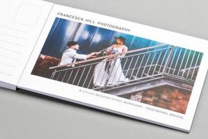
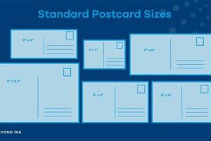
Creating personalized postcards within Microsoft Word offers a straightforward approach to communication, allowing users to combine visual elements with text for various purposes. This involves utilizing Word’s features to format a document to the dimensions of a standard postcard, incorporating images, text boxes, and design elements to craft a unique message.
This method provides a cost-effective and accessible alternative to commercially printed postcards, particularly for small batches or personal projects. Leveraging readily available software eliminates the need for specialized design programs or external printing services. The flexibility offered by Word allows for rapid prototyping and customization, enabling users to adapt designs quickly and easily.
The following sections will detail specific steps and techniques to effectively utilize Microsoft Word for postcard creation. These will cover aspects such as page setup, image insertion, text formatting, and design considerations to produce professional-looking results.
Tips for Postcard Design in Microsoft Word
Effective postcard design requires attention to both visual appeal and practical considerations. The following tips outline key elements for achieving professional results within Microsoft Word.
Tip 1: Page Setup for Precision: Begin by setting the document dimensions to match standard postcard sizes (e.g., 4×6 inches or A6). Precise dimensions ensure proper printing and mailing compatibility.
Tip 2: High-Resolution Imagery: Utilize high-resolution images to maintain visual clarity. Low-resolution images can appear pixelated when printed. Consider image placement and cropping for optimal composition.
Tip 3: Text Hierarchy and Readability: Employ clear and concise messaging. Utilize varying font sizes and styles to establish a visual hierarchy, ensuring important information stands out. Maintain ample white space for readability.
Tip 4: Color Palette and Branding: Choose a cohesive color palette that complements the imagery and message. Consider brand colors for consistent visual identity. Avoid overly cluttered or clashing color combinations.
Tip 5: Strategic Use of Text Boxes: Text boxes offer flexibility in positioning text elements precisely. Leverage text boxes to overlay images or create distinct sections within the postcard design.
Tip 6: Proofreading and Quality Control: Thoroughly review the design for any typographical errors or design inconsistencies before printing. Consider printing a test copy to evaluate color accuracy and overall appearance.
Tip 7: Consider Pre-Made Templates: Microsoft Word offers pre-designed templates that can serve as a starting point. Adapting these templates can expedite the design process while maintaining a professional aesthetic.
By implementing these tips, one can create visually appealing and informative postcards within Microsoft Word, maximizing impact and achieving communication goals.
The concluding section will offer additional resources and recommendations for further exploration of postcard design techniques.
1. Page Setup
Accurate page setup forms the foundation of effective postcard design in Microsoft Word. Correct dimensions, orientation, and margins ensure the final product aligns with printing standards and postal regulations. This foundational step influences all subsequent design choices.
- Page Size:
Selecting the appropriate page size is paramount. Standard postcard dimensions, such as 4×6 inches or A6, dictate the available design area. Choosing a non-standard size can lead to printing and mailing complications. Accurate dimensions from the outset prevent later resizing issues, preserving design integrity.
- Orientation:
Postcard orientation, whether landscape or portrait, impacts the layout and flow of information. Orientation should complement the chosen imagery and messaging. A landscape orientation might suit panoramic images, while a portrait orientation might be better for text-heavy designs. Careful consideration of orientation optimizes visual communication.
- Margins:
Appropriate margins ensure essential design elements remain within the printable area. Insufficient margins can lead to content being cropped during printing. Standard margin settings provide a safe zone for text and images, preventing unintended loss of visual information.
- Layout Type:
While not strictly page setup, choosing between single-sided or double-sided printing is crucial at this stage. This decision impacts design choices. Single-sided postcards focus all content on one face, while double-sided layouts provide space for additional information, addresses, or return messages. Planning this element early optimizes content arrangement and visual balance.
By addressing these page setup elements correctly from the start, one establishes a framework for a successful postcard design within Microsoft Word. Precise page setup facilitates subsequent design choices, ensuring a professional and print-ready final product.
2. Visual Elements
Visual elements play a crucial role in postcard design within Microsoft Word, significantly impacting a recipient’s engagement and message reception. Strategic image selection, graphic integration, and thoughtful color palettes contribute to a postcard’s overall effectiveness. A visually compelling postcard captures attention and effectively conveys the intended message, whether promotional, informative, or personal.
Consider a travel agency promoting a tropical destination. A high-resolution image of a pristine beach evokes a sense of relaxation and escape, immediately drawing the viewer’s interest. Combined with a concise tagline and the agency’s logo, the visual narrative becomes compelling. Alternatively, a non-profit organization might utilize infographics within its postcard design to convey key statistics related to its mission, creating an impactful and informative visual presentation. In both cases, visual elements serve distinct purposes, demonstrating their versatility and importance.
Understanding the interplay between various visual components is essential. For instance, color palettes evoke specific emotions and associations. Bright, vibrant colors might suit a summer sale promotion, while muted, earthy tones convey a sense of sophistication or environmental consciousness. Image placement and sizing also contribute to visual hierarchy, guiding the viewer’s eye through the design. Balancing image and text elements ensures clear communication without visual clutter. Effectively leveraging visual elements within Microsoft Word requires careful consideration of their impact and strategic integration into the overall design, maximizing communication potential.
3. Text Formatting
Text formatting plays a critical role in postcard design within Microsoft Word. Effective formatting enhances readability, establishes visual hierarchy, and reinforces the overall message. Careful font selection, size adjustments, and strategic placement contribute significantly to a postcard’s impact. Ignoring text formatting can lead to a cluttered, unprofessional appearance, diminishing the intended message’s effectiveness.
- Font Selection:
Font choice significantly influences the tone and readability of a postcard. Selecting a font that aligns with the message’s purpose is crucial. A professional sans-serif font might suit a corporate announcement, while a more decorative font might be appropriate for a celebratory message. Font readability across various print sizes should also be considered. Illegible fonts render the message ineffective, regardless of other design choices.
- Font Size and Hierarchy:
Varying font sizes creates visual hierarchy, guiding the recipient’s eye through the information. Larger font sizes emphasize key information, such as headlines or calls to action, while smaller font sizes suit supporting details. A clear hierarchy prevents visual confusion and emphasizes important elements. Consistent sizing within each hierarchical level ensures a cohesive and professional appearance.
- Alignment and Spacing:
Text alignment and spacing contribute significantly to visual organization. Left-aligned text provides a natural reading flow, while centered text can highlight key phrases or headlines. Appropriate line spacing improves readability and prevents text from appearing cramped. Consistent spacing between lines and paragraphs ensures a clean and professional look. Inconsistent spacing can make the text appear disorganized and difficult to read.
- Color and Contrast:
Text color and contrast against the background directly impact readability. Sufficient contrast ensures text legibility. Dark text against a light background or light text against a dark background maximizes readability. Using colors that align with the overall color palette maintains visual cohesion. Low contrast or clashing colors can render text illegible, undermining the design’s effectiveness.
Effective text formatting within Microsoft Word enhances the clarity and impact of postcard designs. By carefully considering font choices, size variations, alignment, spacing, and color contrast, one ensures the message is easily understood and visually appealing. These elements work in concert with other design aspects to create a cohesive and impactful final product.
4. Layout & Composition
Layout and composition are fundamental to effective postcard design in Microsoft Word. Strategic arrangement of visual and textual elements determines how recipients perceive information and engage with the message. A well-composed layout guides the eye, emphasizes key information, and creates a visually appealing and balanced design. Neglecting these principles can result in a cluttered, confusing, and ultimately ineffective communication piece.
- Visual Hierarchy:
Visual hierarchy dictates the order in which elements are perceived. Larger, bolder elements naturally draw the eye first, establishing a clear focal point. Subsequent elements, such as supporting text or contact information, are arranged in descending order of importance. Effective hierarchy ensures recipients grasp the primary message quickly and efficiently. For example, a prominent headline announcing a sale immediately captures attention, followed by details about the offer and location.
- Balance and White Space:
Balance refers to the distribution of visual weight within the design. A balanced layout avoids excessive clustering of elements in one area, creating a sense of stability and visual harmony. White space, or negative space, plays a crucial role in achieving balance. Adequate white space around text and images prevents a cluttered appearance, improving readability and allowing individual elements to stand out. A postcard crammed with information can overwhelm recipients, while a balanced design with ample white space feels inviting and professional.
- Grid Systems and Alignment:
Grid systems provide an underlying structure for organizing elements within the design. Aligning text and images to a grid creates a sense of order and consistency. Grids ensure elements are evenly spaced and visually connected, enhancing overall cohesion. Employing a grid system in a postcard design, even a simple one, provides a framework for arranging various components, such as images, text blocks, and logos, in a harmonious and visually pleasing manner.
- Flow and Direction:
Flow and direction guide the recipient’s eye through the information presented. Strategic placement of elements creates a natural reading path, ensuring the message is received in the intended order. Visual cues, such as arrows or lines, can further enhance flow and direct attention to specific areas. For instance, leading the eye from a captivating image to a call to action encourages engagement and response.
Effective layout and composition within Microsoft Word are essential for creating impactful postcards. By understanding and applying principles of visual hierarchy, balance, grid systems, and flow, one ensures the message is communicated clearly, efficiently, and aesthetically. These elements contribute significantly to a postcard’s overall effectiveness, maximizing its potential to engage recipients and achieve its intended purpose.
5. Printing Considerations
Printing considerations are integral to successful postcard design within Microsoft Word. Design choices directly impact the final printed output. Understanding these considerations ensures the physical postcard accurately reflects the digital design, maximizing its effectiveness. Ignoring these factors can lead to discrepancies between the intended design and the printed result, diminishing the postcard’s impact and potentially wasting resources.
- Paper Stock:
Paper stock selection significantly influences the postcard’s look and feel. Different paper weights, finishes, and textures communicate varying levels of quality and professionalism. A heavier card stock conveys a more premium impression, while a lighter weight might be suitable for budget-conscious projects. Glossy finishes enhance image vibrancy, while matte finishes offer a more subdued, classic look. Choosing an appropriate paper stock enhances the design’s aesthetic and tactile qualities. For instance, a travel agency promoting luxury vacations might opt for a premium, glossy stock to convey a sense of opulence, while a local bakery advertising daily specials might choose a more economical, matte finish.
- Color Management:
Color management ensures accurate color representation from digital design to printed output. Screen colors often appear different when printed due to variations in color models (RGB vs. CMYK). Understanding these differences and calibrating colors accordingly prevents unexpected color shifts. Consulting with print providers about their color profiles ensures color fidelity and avoids disappointing results. For example, a vibrant red designed on screen might appear duller or slightly different in hue when printed without proper color management.
- Print Settings:
Correct print settings within Microsoft Word and on the printer itself are crucial for optimal output. Selecting the correct paper size, orientation, and print quality ensures the design is printed accurately and without distortion. Choosing “high quality” print settings generally yields better results, especially for image-heavy designs. Incorrect settings can lead to cropped images, misaligned text, or poor image quality, diminishing the postcard’s overall impact.
- Bleeds and Margins:
Bleeds extend the design beyond the intended cut lines, ensuring no white borders appear after trimming. Setting bleeds correctly within Words page setup avoids unintended white edges. Adhering to printer-specified bleed requirements is essential for a clean, professional finish. Margins, conversely, define the safe area within the design, ensuring important content is not cut off during trimming. Balancing bleeds and margins correctly is crucial for a polished and visually appealing final product.
Careful consideration of these printing factors ensures the final printed postcard accurately represents the design created in Microsoft Word. By addressing paper stock, color management, print settings, and bleeds/margins, one maximizes the postcard’s impact and avoids potential printing issues. These practical considerations, combined with effective design choices, result in a professional and visually compelling communication piece.
Frequently Asked Questions
This section addresses common inquiries regarding postcard creation within Microsoft Word, offering practical solutions and clarifying potential challenges.
Question 1: Can standard postcard sizes be easily accommodated within Microsoft Word?
Yes, Microsoft Word allows custom page sizing, accommodating standard postcard dimensions like 4×6 inches or A6. Users can input these dimensions directly within the page setup options.
Question 2: What image resolution is recommended for optimal print quality?
Using images with a resolution of 300 dpi (dots per inch) or higher ensures sharp and clear print results, minimizing pixelation.
Question 3: How can one ensure text remains within the printable area?
Setting appropriate margins within page setup defines the safe printable area, preventing text from being cut off during printing. Print previews offer a visual confirmation before printing.
Question 4: What methods ensure consistent branding across postcard designs?
Utilizing brand-specific color palettes, logos, and font styles within the design maintains visual consistency and reinforces brand identity.
Question 5: What are effective strategies for incorporating variable data, such as addresses, into multiple postcards?
Mail merge functionality within Microsoft Word allows efficient integration of variable data from a data source, such as a spreadsheet, personalizing individual postcards.
Question 6: How can one avoid color discrepancies between the screen display and the printed output?
Understanding the difference between RGB (screen) and CMYK (print) color models is crucial. Utilizing CMYK color profiles and consulting with print providers helps minimize color variations.
Addressing these frequently asked questions provides a comprehensive understanding of the process, enabling users to create professional and effective postcards using Microsoft Word.
The following section offers additional resources and tools to further enhance postcard design capabilities.
Conclusion
This exploration has provided a comprehensive overview of creating postcards within Microsoft Word. Key aspects, from initial page setup and image integration to precise text formatting and considered layout choices, contribute significantly to the final product’s effectiveness. Understanding printing considerations, such as paper stock selection and color management, ensures accurate translation from digital design to physical output. Addressing common challenges through practical solutions empowers users to navigate potential difficulties and achieve desired results.
Effective communication relies on a clear and engaging message. Leveraging Microsoft Word’s readily available tools allows one to transform simple digital documents into impactful physical postcards. By applying the techniques and principles outlined, individuals and organizations can produce professional-quality postcards for diverse communication needs, maximizing reach and engagement. Careful attention to detail and thoughtful design choices empower users to harness the full potential of postcard communication within a familiar software environment.


