Stylized typefaces evocative of vintage or handwritten lettering are frequently employed in graphic design to create a nostalgic, personalized, or informal aesthetic. These typefaces often mimic the aesthetic of calligraphy, hand-painted signs, or classic printing techniques, and examples include script, sans-serif, and decorative styles with unique flourishes or imperfections.
Such design choices can enhance the visual appeal of marketing materials, particularly for businesses seeking to establish a unique brand identity or connect with audiences on an emotional level. This design approach, often associated with travel, hospitality, or handcrafted products, can imbue a sense of authenticity and personal touch. Historically, limited printing technology influenced the distinctive styles, often necessitating bold, simple letterforms for clear communication on small formats.
The following sections delve into specific applications of these typographic choices, exploring their effectiveness in various design contexts and offering practical advice for selecting and utilizing them effectively.
Tips for Effective Typographic Choices
Careful typeface selection is crucial for successful visual communication. The following tips offer guidance for selecting and utilizing appropriate styles effectively.
Tip 1: Consider the Target Audience: Formal scripts convey elegance and sophistication, while bolder, more playful styles suit lighthearted brands. Matching typeface to the intended audience ensures effective communication.
Tip 2: Prioritize Legibility: While decorative typefaces can enhance visual appeal, readability remains paramount. Ensure chosen styles remain clear and easily deciphered, especially at smaller sizes.
Tip 3: Pair Fonts Carefully: Combining multiple typefaces requires careful consideration. Limit pairings to two or three complementary styles to avoid visual clutter and maintain a cohesive aesthetic.
Tip 4: Utilize Hierarchy Effectively: Employ variations in size, weight, and style to establish clear visual hierarchy, guiding the reader’s eye through the content.
Tip 5: Test Across Different Media: Ensure chosen typefaces render effectively across various platforms, including print and digital formats, maintaining consistent visual identity.
Tip 6: Explore Historical Context: Understanding the history and origins of specific typefaces can inform design decisions, ensuring appropriate and impactful usage.
Tip 7: Maintain Consistency: Consistent typeface usage reinforces brand identity and promotes a professional, polished appearance across all materials.
By adhering to these guidelines, designers can leverage typography to create visually appealing and effective communication materials.
These typographic principles contribute significantly to successful design, ultimately enhancing communication and brand perception.
1. Readability
Readability is paramount for effective postcard design. Given the limited space and viewing time, clear and easily digestible typography ensures the message reaches the intended audience effectively. Overly decorative or complex typefaces, while visually appealing, can hinder comprehension, thus undermining the postcard’s purpose.
- Font Choice
Selecting appropriate typefaces significantly impacts readability. Simple, clean fonts generally offer better legibility than highly stylized or ornate options. Consider the target audience and postcard’s purpose when making selections. For example, a sans-serif font might suit a modern, minimalist design, while a classic serif font might be appropriate for a more traditional aesthetic. Excessive use of script fonts, although potentially evocative, can impede readability, particularly at smaller sizes.
- Size and Weight
Font size and weight play critical roles in readability. Text should be large enough to be easily read at a glance, yet balanced with other design elements. Bold or heavy weights can enhance prominence, but overuse can make the text appear dense and overwhelming. Conversely, excessively thin fonts can be difficult to decipher, especially in less-than-ideal lighting conditions. Optimal size and weight depend on the chosen font and overall design.
- Spacing and Layout
Appropriate spacing between letters, words, and lines enhances readability. Cramped text appears cluttered and difficult to follow, while excessive spacing can disrupt visual flow. Line height, or leading, influences how easily the eye tracks from one line to the next. Careful attention to kerning and tracking ensures proper letter spacing, especially for headlines or larger text. Thoughtful layout, including the use of white space, guides the reader’s eye and improves overall comprehension.
- Contrast and Background
Sufficient contrast between text and background is essential for readability. Light text on a light background or dark text on a dark background creates visual strain and hinders comprehension. High contrast, such as dark text on a light background or vice versa, ensures optimal legibility. Background images or patterns, while visually appealing, can interfere with readability if not carefully considered. Text should always remain clear and distinct from the background.
These readability factors significantly influence a postcard’s effectiveness. By prioritizing clear and accessible typography, designers ensure the intended message resonates with the audience, maximizing the postcard’s impact.
2. Style
Typeface style significantly contributes to a postcard’s overall aesthetic and communicative effectiveness. Style selection should align with the postcard’s purpose, target audience, and desired mood. Understanding various style categories and their implications aids informed decision-making.
- Handwritten/Script Fonts
Script fonts, often mimicking calligraphy or handwriting, evoke a sense of personalization and warmth. They are well-suited for invitations, announcements, or postcards emphasizing a handcrafted or artistic feel. However, legibility considerations are crucial, especially with elaborate scripts. Examples include Brush Script, Pacifico, and Alex Brush. Overuse can diminish impact, so employing them strategically for specific elements, like titles or short messages, maintains visual balance.
- Vintage/Retro Fonts
Vintage or retro fonts evoke nostalgia and classic design aesthetics. They can be particularly effective for postcards related to historical events, vintage products, or businesses seeking a classic brand identity. Examples include Cooper Black, Bebas Neue, and Playfair Display. Careful pairing with other design elements, such as imagery and color palettes, enhances the overall retro effect. Overuse can appear clichd, so judicious application is key.
- Modern/Minimalist Fonts
Modern and minimalist fonts, characterized by clean lines and simple forms, project a contemporary and sophisticated aesthetic. They are well-suited for businesses, events, or products emphasizing sleek design and clear communication. Examples include Helvetica, Futura, and Open Sans. These fonts offer excellent readability and versatility, making them suitable for various postcard formats and purposes. Their simplicity allows other design elements to take center stage.
- Decorative/Display Fonts
Decorative or display fonts, often featuring unique embellishments or ornate details, are best used sparingly for headlines or short text elements requiring emphasis. Their primary purpose is to attract attention and create a strong visual impact. Examples include Lobster Two, Pacifico, and Amatic SC. Overuse can detract from readability and appear cluttered, so careful consideration of context and placement is essential. Pairing them with simpler fonts for body text maintains visual balance.
Selecting an appropriate typeface style is integral to effective postcard design. Careful consideration of these categories, along with the postcard’s overall message and target audience, ensures a visually appealing and communicative final product.
3. Size
Typeface size significantly impacts legibility and overall visual appeal in postcard design. Size choices should reflect the postcard’s dimensions, the quantity of text, and the intended viewing distance. Larger sizes command attention and are suitable for headlines or key messages, while smaller sizes are appropriate for body text or supporting details. Disproportionately large text can appear overwhelming and disrupt visual balance, while excessively small text hinders readability, rendering the message ineffective. Striking an appropriate balance ensures effective communication and a visually appealing design.
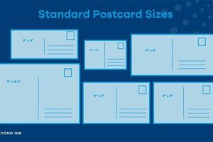
Consider a standard postcard size of 4×6 inches. A headline might use a font size of 24-36 points to ensure prominence, while body text might range from 10-12 points for comfortable reading. Smaller details, such as contact information or website addresses, could utilize even smaller sizes, ensuring they remain legible without dominating the design. Adjustments may be necessary for larger or smaller postcard formats. For example, a larger postcard might require proportionally larger font sizes to maintain visual impact. Conversely, a smaller postcard might necessitate smaller sizes to accommodate all necessary information without appearing cluttered.
Appropriate typeface size contributes significantly to a postcard’s effectiveness. Careful consideration of the postcard’s dimensions, the amount of text, and the desired visual hierarchy ensures clear communication and a balanced, aesthetically pleasing design. Ignoring size considerations can compromise readability and overall impact, diminishing the postcard’s communicative potential. Testing different size variations before finalizing the design is recommended to ensure optimal legibility and visual appeal across various viewing distances.
4. Spacing
Spacing significantly influences the readability and aesthetic appeal of postcard typography. Careful management of spacing between letters, words, and lines enhances visual clarity and guides the reader’s eye through the information presented. Improper spacing can hinder comprehension and detract from the postcard’s overall design. The following facets explore the nuances of spacing and their impact on postcard typography.
- Tracking (Letter-Spacing)
Tracking adjusts the uniform spacing between letters within a word or phrase. Tight tracking condenses text, potentially impacting legibility, particularly at smaller sizes or with complex typefaces. Loose tracking increases spacing, which can improve readability for headlines or short text blocks but may appear awkward for longer passages. For instance, slightly looser tracking might enhance the readability of a headline set in a condensed font, while tighter tracking might be appropriate for a decorative typeface used for a short, impactful message. Careful adjustment of tracking ensures visual balance and optimal legibility.
- Kerning (Pair-Kerning)
Kerning addresses the specific spacing between individual letter pairs to improve visual harmony and readability. Certain letter combinations, such as “AV” or “WA,” often require adjustment due to their inherent shapes. Kerning corrects awkward spacing, creating a more even and visually pleasing text flow. Inconsistent kerning can disrupt readability and appear unprofessional. While some design software automates kerning, manual adjustments are often necessary for optimal results, especially with display typefaces or large font sizes.
- Leading (Line-Height)
Leading, also known as line height, controls the vertical space between lines of text. Insufficient leading creates a cramped appearance, hindering readability and potentially causing visual fatigue. Generous leading improves readability and allows the eye to flow more easily through the text. The optimal leading depends on the typeface, font size, and overall design aesthetic. For example, body text typically benefits from slightly more leading than headlines, improving readability for longer passages.
- White Space
White space, or negative space, refers to the empty areas surrounding text and other design elements. Strategic use of white space enhances readability and creates visual breathing room, preventing the postcard from appearing cluttered. Sufficient white space around text blocks improves visual clarity and allows individual elements to stand out. Excessive white space can make the design appear sparse or unbalanced, while insufficient white space can create a cramped and overwhelming appearance. Balancing text and white space is crucial for achieving an effective and visually appealing postcard design.
Careful consideration of these spacing elements significantly impacts the overall effectiveness of postcard typography. Balancing tracking, kerning, leading, and white space enhances readability, improves visual flow, and creates a more professional and aesthetically pleasing design. Negligence in managing spacing can undermine the postcard’s communicative potential and detract from its visual appeal.
5. Context
Contextual awareness is paramount when selecting typefaces for postcards. The postcard’s purpose, target audience, and subject matter significantly influence appropriate font choices. A typeface suitable for a wedding announcement differs drastically from one appropriate for a product promotion. Formal events benefit from elegant, classic typefaces, while informal occasions allow for more playful or contemporary choices. Consider a travel postcard promoting a historical site; a vintage or classic typeface might enhance the message’s authenticity, whereas a modern sans-serif font might appear incongruous. Conversely, a technology conference postcard might benefit from a sleek, futuristic font, while a script font would likely appear out of place.
Analyzing the target audience further refines font selection. A postcard targeting a younger demographic might employ trendy or playful typefaces, while a postcard aimed at a more mature audience might benefit from classic, easily readable fonts. Geographic and cultural context also play a role. Typefaces popular in one region might not resonate as effectively in another. For instance, a postcard distributed in Japan might utilize typefaces reflecting Japanese calligraphy or design aesthetics. The postcard’s distribution method also informs font selection. A postcard intended for online distribution necessitates fonts rendering effectively on various screen resolutions and devices, while a physically mailed postcard offers more flexibility in font choices.
Effective typeface selection hinges on a comprehensive understanding of the postcard’s context. Ignoring contextual factors can lead to inappropriate font choices, undermining the postcard’s message and diminishing its impact. A thoughtful analysis of purpose, audience, subject matter, and distribution method ensures typeface selection aligns with the overall communication goals. This alignment enhances message clarity, reinforces brand identity, and maximizes the postcard’s effectiveness in achieving its intended purpose.
Frequently Asked Questions about Typeface Selection for Postcards
This section addresses common queries regarding appropriate typeface selection for postcard design, aiming to clarify potential misconceptions and offer practical guidance.
Question 1: How many different typefaces should be used on a single postcard?
While no strict rule exists, limiting typeface usage to two or three complementary styles generally maintains visual cohesion and avoids a cluttered appearance. Excessive typeface variation can distract from the message and appear unprofessional.
Question 2: Are script fonts suitable for all postcard designs?
Script fonts, while visually appealing, can compromise readability, especially at smaller sizes or for extended text blocks. Their suitability depends on the postcard’s overall design, target audience, and message length. Consider reserving script fonts for headlines, short messages, or design elements where legibility is less critical.
Question 3: How does font size impact postcard readability?
Font size directly influences readability. Text must be large enough to be easily discernible at a glance, yet balanced with other design elements and the postcard’s dimensions. Overly large text can overwhelm the design, while excessively small text hinders comprehension. Appropriate size selection depends on the chosen typeface, viewing distance, and amount of text.
Question 4: What role does spacing play in postcard typography?
Spacing between letters, words, and lines (tracking, kerning, and leading, respectively) significantly impacts readability and visual appeal. Proper spacing ensures clear differentiation between characters and lines, facilitating comfortable reading. Inconsistent or improper spacing can hinder comprehension and detract from the design’s professionalism.
Question 5: How does the postcard’s purpose influence font selection?
The postcard’s purpose dictates appropriate typeface choices. Formal occasions demand elegant, classic typefaces, while informal contexts allow for more contemporary or playful styles. Promotional postcards might benefit from bold, attention-grabbing fonts, whereas informational postcards might prioritize clear, easily readable typefaces. Aligning font selection with the postcard’s objective ensures effective communication.
Question 6: How can one ensure consistent typography across multiple postcards within a campaign?
Establishing a style guide defining designated typefaces, sizes, and spacing guidelines ensures consistent typography across a postcard campaign. This consistency reinforces brand identity and creates a unified visual experience, maximizing the campaign’s impact.
Careful consideration of these frequently asked questions ensures effective and visually appealing typeface choices for postcard designs. Prioritizing readability, visual balance, and alignment with the postcard’s purpose and target audience maximizes communicative impact.
The next section will delve into practical examples of effective postcard typography, showcasing successful design implementations and offering further inspiration.
Conclusion
Effective postcard design hinges on careful typeface selection. Considerations encompassing readability, style, size, spacing, and contextual relevance ensure impactful communication. Prioritizing legibility through appropriate font choices, sizes, and spacing ensures clear message delivery. Style selection, aligned with the postcard’s purpose and target audience, enhances visual appeal and reinforces brand identity. Careful size and spacing choices optimize readability and visual balance. Contextual awareness, considering the postcard’s purpose, audience, and subject matter, guides effective font selection, ensuring the chosen typeface complements the overall message and resonates with the intended recipients.
Strategic typeface selection elevates postcard design from mere visual presentation to a powerful communication tool. By understanding and applying these typographic principles, designers can maximize a postcard’s impact, ensuring clear communication and a lasting impression. Continual exploration of evolving typographic trends and best practices further enhances design effectiveness and ensures ongoing relevance in the ever-changing landscape of visual communication.


