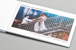
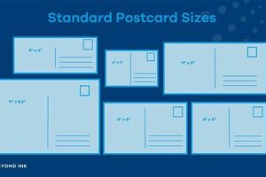
The arrangement of elements on a postcard, including text, images, and address sections, determines its effectiveness. A well-considered structure can enhance readability, highlight key information, and create a visually appealing presentation. For example, a travel postcard might feature a large, captivating image on one side and designated spaces for an address, stamp, and short message on the other.
Effective arrangements contribute significantly to a postcard’s impact, whether for personal communication, marketing, or artistic expression. A clear hierarchy of information ensures the recipient quickly grasps the message, while visually engaging designs can leave a lasting impression. Historically, the standardized format has facilitated efficient postal services and allowed for creative expression within a constrained space.
This exploration will delve into various structural approaches, considering best practices for design and addressing diverse applications, from direct mail marketing to personalized correspondence.
Tips for Effective Postcard Design
Strategic placement of elements contributes significantly to a postcard’s success. These guidelines offer practical advice for creating impactful designs.
Tip 1: Prioritize Visual Hierarchy: Guide the viewer’s eye by establishing a clear focal point, typically a compelling image or headline. Supporting elements should be arranged to complement this primary focus.
Tip 2: Optimize White Space: Avoid cluttered designs by incorporating ample white space. This improves readability and allows key elements to stand out. Margins and padding contribute to a clean, professional look.
Tip 3: Consider the Target Audience: Design choices should align with the recipient’s demographics and interests. A postcard aimed at a younger audience might employ bolder graphics and typography than one intended for a more mature demographic.
Tip 4: Maintain Balance and Proportion: Elements should be distributed harmoniously across the postcard’s surface. Avoid overly heavy or light areas, striving for visual equilibrium.
Tip 5: Choose Readable Typography: Select fonts that are easy to read at a glance. Font sizes should be appropriate for the amount of text and the viewing distance. Limit the number of different fonts used to maintain consistency.
Tip 6: High-Quality Imagery Is Crucial: Whether using photographs or illustrations, image quality directly impacts the postcard’s perceived value. Blurry or pixelated images detract from the overall presentation.
Tip 7: Test Before Printing: Review a physical proof before committing to a large print run. This allows for a final check of color accuracy, image clarity, and overall design effectiveness.
By adhering to these guidelines, one can create postcards that effectively communicate their message and leave a positive impression.
These practical design considerations are essential for maximizing the impact and effectiveness of the chosen format. The subsequent section will provide concluding remarks.
1. Visual Hierarchy
Visual hierarchy plays a crucial role in effective postcard design. It guides the viewer’s eye through the presented information in a specific order, ensuring key elements receive attention first. This structured approach enhances readability and comprehension. Without a clear hierarchy, a postcard can appear cluttered and its message lost. Consider a postcard advertising a sale. The most important informationthe discount percentage or offershould be the most prominent element, followed by the relevant dates and lastly, the store’s location and contact details. This prioritized arrangement ensures the recipient immediately grasps the core message.
Establishing visual hierarchy is achieved through various design techniques. Size and scale are fundamental: larger elements naturally draw the eye first. Color contrast can highlight key information, making it stand out against a less saturated background. Typographic choices, such as using a bold typeface for headlines, contribute to a clear hierarchy. Strategic placement also plays a role; centrally located elements often receive more attention than those placed at the edges. For instance, a postcard featuring a dominant image of a product with a concise, boldly typed headline placed directly beneath it creates a clear focal point and directs the viewer to the supporting details below.
Understanding and applying the principles of visual hierarchy is essential for creating effective postcard layouts. It ensures the intended message is communicated clearly and efficiently, maximizing the postcard’s impact. Failure to establish a clear hierarchy can lead to confusion and diminish the effectiveness of the communication, potentially resulting in a missed opportunity to engage the recipient. Therefore, careful consideration of visual hierarchy is a fundamental aspect of successful postcard design.
2. Balance
Balance in design, akin to its counterpart in physics, strives for equilibrium. Within the constrained canvas of a postcard, balance ensures visual harmony and prevents the composition from appearing lopsided or incomplete. A balanced layout enhances readability and contributes to a professional, aesthetically pleasing presentation, crucial for conveying information effectively and capturing audience attention. Imbalance can lead to visual discomfort and distract from the intended message.
- Symmetrical Balance
Symmetrical balance, also known as formal balance, mirrors elements across a central axis. This approach creates a sense of stability and order. Imagine a postcard with a centered image and text blocks of equal size on either side. While effective for conveying formality and elegance, strict symmetry can sometimes appear static or predictable. In postcard design, symmetrical balance is often employed for corporate communications or announcements where a sense of professionalism and reliability is paramount.
- Asymmetrical Balance
Asymmetrical balance achieves equilibrium through the strategic distribution of dissimilar elements. Visual weight, determined by factors like size, color, and contrast, guides this arrangement. A large image on one side might be balanced by a smaller image and a block of text on the other. This dynamic approach creates visual interest and a more contemporary feel. Postcards promoting creative events or products often utilize asymmetry to convey a sense of energy and innovation.
- Radial Balance
Radial balance emanates from a central point, with elements radiating outwards. This approach is less common in standard rectangular postcards but can be highly effective for circular designs or specific visual effects. Think of a postcard announcing a festival, with the event date radiating from a central image. Radial balance creates a strong focal point and a sense of movement or expansion.
- Off-Balance Layouts
While less common, intentionally off-balance layouts can create a sense of tension or dynamism. This approach should be used judiciously, as excessive imbalance can appear chaotic and detract from the message. A slightly off-center image, for example, might evoke a sense of urgency or movement, suitable for promoting a time-sensitive offer. However, ensuring readability and maintaining visual appeal remains crucial even in off-balance designs.
Understanding and implementing these different types of balance empowers designers to create postcards that are not only visually appealing but also effectively communicate their intended message. The chosen balance approach significantly contributes to the overall impact of the postcard, influencing how the recipient perceives the information presented. A well-balanced layout enhances clarity and engagement, maximizing the effectiveness of the communication.
3. White Space
White space, also known as negative space, refers to the unoccupied areas within a design. Its strategic use is crucial for effective postcard layouts, contributing significantly to readability, visual hierarchy, and overall aesthetic appeal. Far from being merely empty space, white space provides breathing room for the elements, preventing a cluttered appearance and guiding the recipient’s eye through the information presented.
- Improved Readability
Ample white space around text blocks enhances readability by reducing visual fatigue and allowing the eye to flow smoothly between words and lines. Consider a postcard with densely packed text versus one with generous margins and spacing. The latter significantly improves comprehension and encourages engagement with the content. In postcard layouts, where space is limited, strategic white space allocation maximizes the impact of the written message.
- Enhanced Visual Hierarchy
White space plays a vital role in establishing visual hierarchy. By separating elements and creating clear visual breaks, it guides the viewer’s attention to the most important information first. For instance, a prominent headline surrounded by white space immediately draws the eye, establishing its importance before the recipient processes the supporting details. This principle is particularly relevant in postcard layouts where concise communication is paramount.
- Elevated Aesthetic Appeal
Generous white space contributes to a clean, professional, and aesthetically pleasing design. It conveys a sense of sophistication and elevates the perceived value of the postcard. Compare a cluttered, discount store flyer with a minimalist, high-end fashion advertisement. The strategic use of white space in the latter communicates quality and exclusivity. This principle applies equally to postcard layouts, regardless of the specific content.
- Types of White Space
White space isn’t limited to large blank areas. Micro white space, the small gaps between letters, words, and lines, also plays a significant role in readability. Macro white space, the larger areas between design elements, contributes to overall balance and visual hierarchy. Understanding and utilizing both types of white space is crucial for effective postcard layout design. For instance, adjusting letter spacing (kerning) can significantly impact the readability of a headline, while the margins around an image contribute to its visual prominence.
In conclusion, the considered integration of white space is integral to successful postcard layouts. Its impact extends beyond mere aesthetics, directly influencing readability, visual hierarchy, and overall message effectiveness. By understanding and applying the principles of white space, designers can create postcards that not only capture attention but also communicate their message clearly and efficiently, maximizing the potential for engagement and impact.
4. Typography
Typography significantly impacts the effectiveness of postcard layouts. Font choices influence readability, convey brand personality, and contribute to the overall visual hierarchy. Legibility is paramount; postcard recipients often have limited viewing time. Therefore, selecting clear, easily discernible fonts ensures quick and efficient communication. Font size must also be considered in relation to the postcard’s dimensions and the viewing distance. Overly small or large text can hinder readability. For instance, a postcard announcing a concert might utilize a bold, attention-grabbing typeface for the band’s name, paired with a more subdued font for supporting details like the date, time, and venue. This combination establishes clear visual hierarchy and ensures quick comprehension of essential information.
Beyond legibility, font selection contributes to the overall aesthetic and conveys specific messages. A postcard for a luxury brand might employ an elegant serif font to communicate sophistication and exclusivity. Conversely, a postcard promoting a children’s event might feature a playful, rounded sans-serif font to create a sense of fun and approachability. These choices influence the recipient’s perception and align with the brand’s identity. Furthermore, font pairings must be carefully considered. Using too many different fonts can create a cluttered and unprofessional appearance. Typically, two or three complementary fonts suffice for a cohesive and impactful design. For example, a travel postcard might combine a classic serif font for descriptive text with a modern sans-serif font for headlines and location names, creating visual interest while maintaining a balanced aesthetic.
Effective typography integrates seamlessly with other design elements, enhancing overall visual communication. It reinforces visual hierarchy, guiding the recipient’s eye through the information. Font choices complement imagery and color palettes, creating a cohesive and impactful message. Failure to consider typography can undermine the postcard’s effectiveness, hindering readability and detracting from the intended message. Therefore, careful typographic selection is crucial for maximizing the impact of postcard layouts, ensuring clear communication and a positive recipient experience. Strategic font choices contribute to visual appeal and reinforce brand identity, ultimately enhancing the postcard’s effectiveness as a communication tool.
5. Imagery
Imagery is integral to postcard design, significantly impacting viewer engagement and message conveyance. Visual elements often form the initial point of contact, capturing attention and setting the tone for the overall communication. Careful image selection and integration within the layout are crucial for maximizing a postcard’s effectiveness. From evocative photographs to illustrative graphics, imagery choices significantly contribute to a postcard’s impact and success.
- Image Quality and Resolution
High-resolution images are crucial for maintaining professional presentation and visual clarity. Blurry or pixelated visuals detract from the overall design and can convey a lack of attention to detail. Postcards showcasing scenic landscapes or product photography, for example, rely heavily on crisp, high-quality imagery to effectively communicate their message. Investing in professional photography or sourcing high-resolution stock images is essential for creating visually appealing and impactful postcards. Compromised image quality undermines the credibility of the message and diminishes the recipient’s engagement.
- Relevance and Context
Image selection should align closely with the postcard’s message and target audience. A postcard promoting a travel destination, for instance, benefits from imagery showcasing the location’s key attractions or unique experiences. Similarly, a postcard announcing a product launch should feature clear, informative visuals of the product itself. Irrelevant or generic imagery can confuse the recipient and diminish the postcard’s effectiveness. Careful consideration of the target audience’s interests and expectations is paramount when selecting appropriate visuals. A postcard advertising a tech product, for example, might employ sleek, modern imagery, while a postcard for a handcrafted product might utilize more rustic or artistic visuals.
- Composition and Framing
Image composition and framing significantly impact visual appeal and storytelling. Thoughtful cropping and framing techniques can highlight key details and guide the viewer’s eye through the image. A postcard showcasing a culinary experience might employ close-up shots of the dish to emphasize its textures and colors, while a postcard promoting a travel destination might feature wide-angle shots to capture the vastness and beauty of the landscape. Understanding compositional principles like the rule of thirds and leading lines can significantly enhance the visual impact of postcard imagery.
- Integration with Text and Layout
Effective postcard design seamlessly integrates imagery with text and other layout elements. Images should complement the written message and contribute to the overall visual hierarchy. A postcard announcing a sale might feature a prominent image of the discounted product alongside a bold headline highlighting the offer. Careful consideration of image placement, size, and relationship to other design elements ensures a balanced and cohesive composition. Overlapping text and images or cluttered layouts can diminish readability and detract from the overall visual appeal. Strategic image placement and scaling ensure a clear and engaging presentation, maximizing the postcard’s communicative effectiveness.
In summary, imagery selection and integration are crucial considerations in postcard design. High-quality, relevant visuals, thoughtfully composed and seamlessly integrated within the layout, significantly enhance a postcard’s ability to capture attention, convey information, and achieve its intended communicative purpose. By understanding and applying these principles, designers can maximize the impact of postcard layouts and create visually compelling pieces that effectively engage their target audience.
6. Target Audience
Understanding the target audience is paramount for effective postcard design. Layout choices must resonate with the intended recipients’ demographics, interests, and expectations. A postcard’s success hinges on its ability to engage the target audience, prompting desired actions, whether it’s visiting a store, attending an event, or exploring a website. Therefore, aligning design elements with audience characteristics is crucial for maximizing impact and achieving communication objectives.
- Demographics
Demographics, including age, gender, location, and socioeconomic status, significantly influence design choices. A postcard targeting retirees, for example, might employ larger font sizes and classic imagery, while a postcard aimed at young adults might utilize bolder graphics and trendier visuals. Location-specific demographics can inform design choices related to cultural sensitivities and regional preferences. Understanding the target audience’s demographic profile ensures the postcard’s message resonates effectively.
- Interests and Lifestyle
Aligning imagery and messaging with the target audience’s interests and lifestyle enhances engagement. A postcard promoting outdoor gear, for instance, would likely feature images of people engaging in outdoor activities, appealing to individuals with an active lifestyle. Similarly, a postcard advertising a cooking class would benefit from imagery showcasing delicious food and culinary experiences, targeting individuals interested in cooking and gastronomy. Considering lifestyle factors ensures the postcard’s message aligns with the recipient’s values and aspirations.
- Visual Preferences
Visual preferences vary significantly across different target audiences. Color palettes, typography, and imagery styles should align with the aesthetic sensibilities of the intended recipients. A postcard targeting a design-savvy audience might employ minimalist layouts and sophisticated typography, while a postcard aimed at a younger demographic might utilize vibrant colors and playful graphics. Understanding visual preferences ensures the postcard is visually appealing and engaging to the target audience, increasing the likelihood of a positive response.
- Communication Style
Tailoring the communication style to the target audience enhances message clarity and reception. Formal language might be appropriate for corporate communications, while a more informal and conversational tone might resonate better with a younger audience. Humor or emotional appeals can be effective depending on the target audience and the message being conveyed. Aligning the communication style with audience expectations ensures the message is received as intended and fosters a positive connection.
Considering the target audience’s characteristics ensures that postcard layouts effectively communicate the intended message and prompt the desired response. By carefully analyzing demographics, interests, visual preferences, and communication styles, designers can create postcards that resonate with recipients, maximizing engagement and achieving communication goals. Failing to consider the target audience can lead to ineffective messaging and missed opportunities for connection and conversion.
Frequently Asked Questions
This section addresses common inquiries regarding effective postcard design and layout strategies.
Question 1: What is the standard postcard size?
While variations exist, the most common standard size is 4 x 6 inches. This size offers a practical balance between ample space for content and cost-effective printing and mailing.
Question 2: How does one effectively use white space in a limited area?
Strategic placement of margins, padding, and spacing between elements maximizes the impact of white space, even within a constrained area. Prioritizing key information and eliminating unnecessary clutter contributes to a clean, readable design.
Question 3: Which fonts are generally recommended for postcard readability?
Clear, legible fonts such as Arial, Helvetica, or Times New Roman are generally recommended for optimal readability. Font size should be proportionate to the postcard’s dimensions and viewing distance.
Question 4: What resolution is recommended for postcard images?
A resolution of 300 dpi (dots per inch) is recommended for ensuring image clarity and preventing pixelation upon printing. High-resolution images contribute to a professional and visually appealing final product.
Question 5: How can one ensure design consistency across multiple postcard campaigns?
Establishing brand guidelines for typography, color palettes, and imagery ensures consistent visual identity across various campaigns. Utilizing templates and style guides streamlines the design process and maintains brand cohesion.
Question 6: What are common mistakes to avoid in postcard design?
Common pitfalls include cluttered layouts, excessive text, low-resolution images, and inconsistent branding. Adhering to design principles and reviewing proofs before printing mitigates these potential issues.
Understanding these common inquiries and implementing the suggested best practices contributes significantly to successful postcard design and maximizes the effectiveness of marketing or communication efforts.
The following section offers concluding remarks and summarizes key takeaways for impactful postcard layouts.
Postcard Layouts
Effective postcard layouts are crucial for successful communication. Strategic arrangement of visual elements, including typography, imagery, and white space, ensures message clarity and audience engagement. Careful consideration of the target audience informs design choices, maximizing impact and achieving communication objectives. Adherence to design principles, such as visual hierarchy and balance, contributes to a professional and aesthetically pleasing presentation. High-quality imagery and legible typography enhance readability and reinforce the intended message. From marketing campaigns to personal correspondence, well-executed structures optimize communication effectiveness within the postcard’s limited canvas.
Strategic visual communication within the constraints of postcard layouts offers significant potential for impactful messaging. By understanding and applying the principles outlined herein, one can elevate communications, ensuring that each postcard achieves its intended purpose, whether promoting a product, announcing an event, or simply conveying a heartfelt message. Effective postcard layouts represent an enduring and versatile medium for impactful communication in a visually driven world.


